Coveo for Sitecore Hive Search Page Structure
Coveo for Sitecore Hive Search Page Structure
This article presents how a Coveo for Sitecore Hive search page is structured.
The base layout defines generic placeholders in which you can add components. Some components present more specific placeholders, allowing you to add more specific components. This way, you can easily build a search page from scratch.
The Default Search Layout
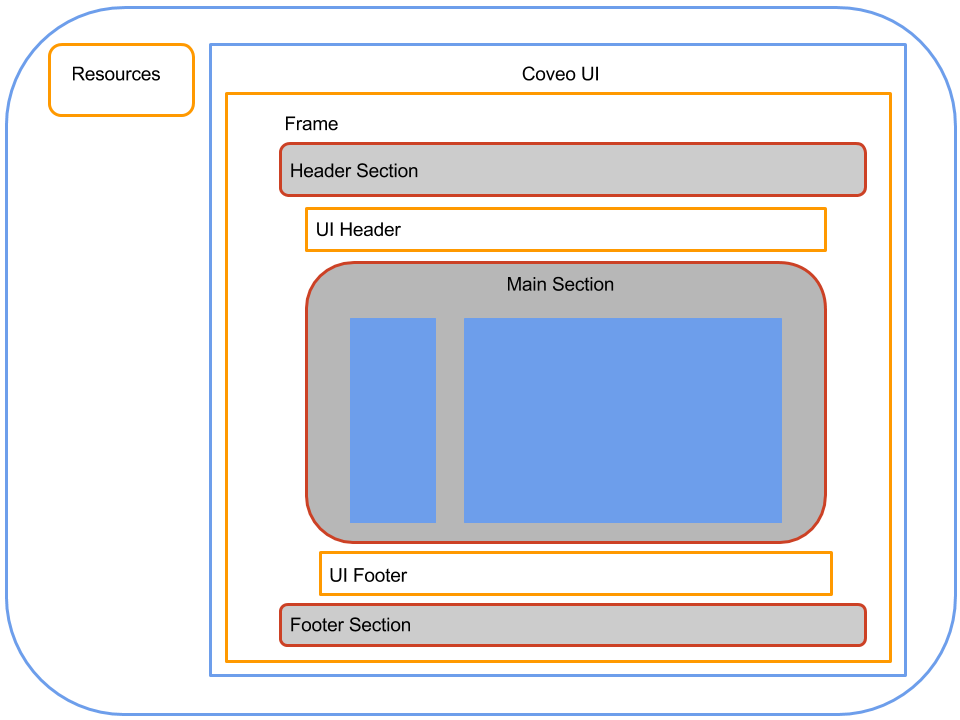
A Coveo for Sitecore Hive page is essentially made up of two placeholders: coveo-ui and coveo-ui-resources.

coveo-ui
Allows you to add a variety of components. While the majority of these components are visual components with which the end user interacts, there are also some components that are invisible to the end user but still influence the page behavior.

coveo-ui-resources
This placeholder holds the common scripts that are required to make all the other components work together.
Adding Resources and Search Interface

The search interface provides two things.
- It includes a set of common components that are used in almost any search interface. These component options are modified through the search interface component itself.
- It includes the UI Content placeholder.
UI Content
This placeholder allows you to add frame components that better define how the visual components are organized in the page. The available frames are:
- Default Frame
- Modular Frame
- Modular Frame - 3 columns
Adding the Default Frame
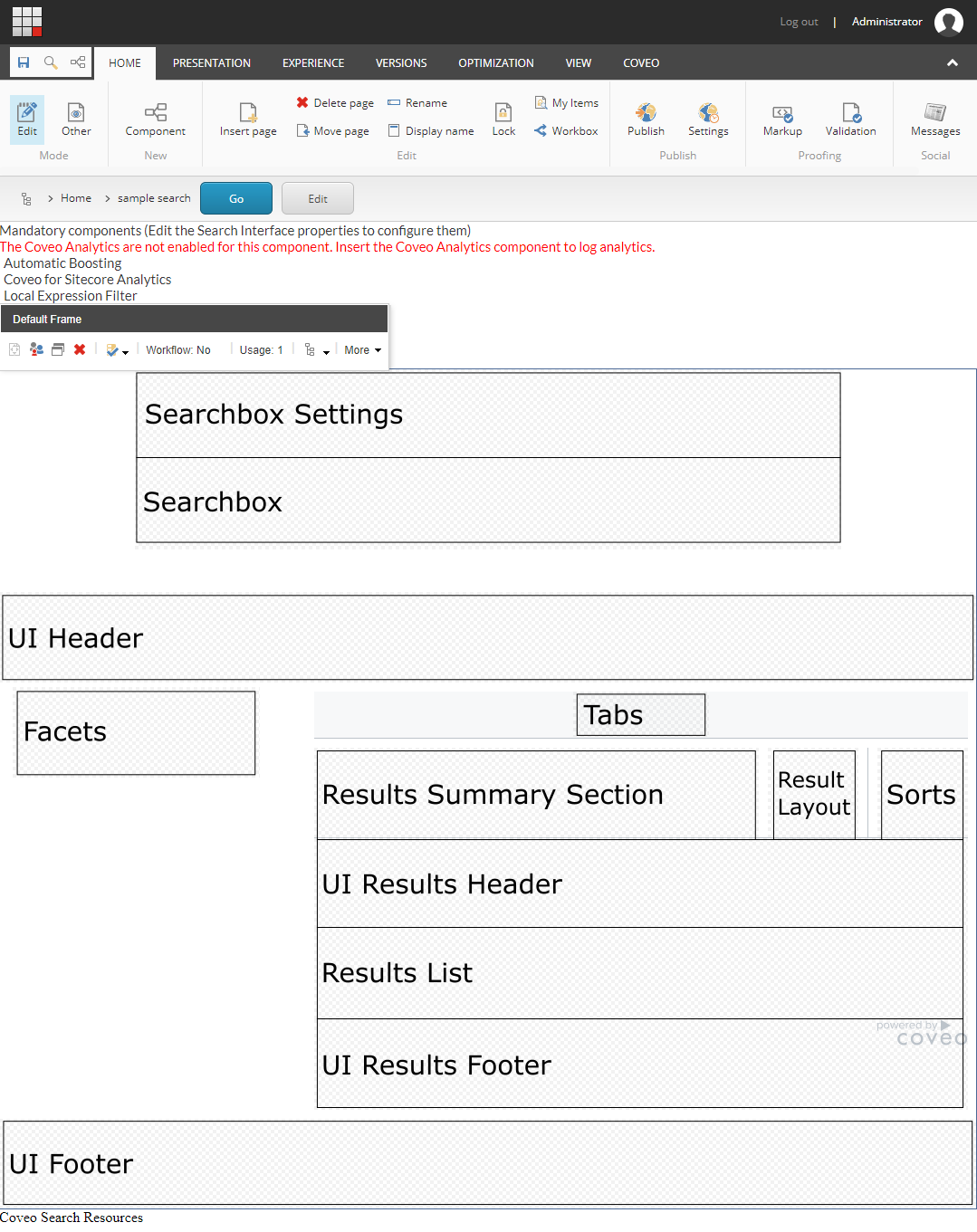
When adding the default frame, you get a page with different placeholders. Each placeholder corresponds to the following components:

Searchbox Zone
The searchbox zone is composed of 3 placeholders: Searchbox Settings, Searchbox, and Searchbox Options.
Searchbox Settings
This placeholder allows you to add the Searchbox Settings component. This is the ellipsis button that appears next to the searchbox, activating some additional searchbox features. Those features depend on the components added to the Searchbox Options placeholder.
The Searchbox Options placeholder only appears when a Searchbox Settings component is added to the Searchbox Settings placeholder.
Searchbox
This is the main placeholder of the Searchbox zone. It’s meant to hold the searchbox component.
Searchbox Options
This placeholder allows you to add optional search box features such as:
- Advanced Search
- Preferences Panel
- Share Query
- Export to Excel
UI Header
This placeholder allows you to add a variety of components that aren’t visible to the users such as additional resources, query filters, or external content. It also allows visual components like pagers, query statistics, and others to be placed.
Facets
This placeholder allows you to add a variety of facet components such as slider and range facets. A distance facet is also available. The facets allow the end user to easily refine the search results with his own criteria.
Tabs
This placeholder allows you to add the Tab component. The tab is useful when you want to present different groups of content in a single search page. For example, you could have a tab that shows people results and another showing products.
Results Summary Section
This placeholder allows you to display information on the current query. It allows you to add the following components:
- Query Summary
- Query Duration
Result Layout
This placeholder allows you to add components allowing the user to select which layout to use to display the search results. For example, the user could view the search results either as a list or as cards. It allows you to add the Result Layout component.
Sorts
This placeholder allows to add various sort components to sort results by:
- Relevancy
- Date
- Field
- Distance
Search Results Zone
The search results zone is composed of these 3 placeholders: UI Results Header, Results List, and UI Results Footer.
UI Results Header
This placeholder allows you to add various components displaying information about the current query and results such as:
- Breadcrumb
- Did you mean
- Query execution time
- Number of results
Results List
This placeholder allows you to add result lists to the page. Usually, a search page will have only one result list. However, you might want different representations of the same results, for example to be able to view results as list or as cards. In this case, you will include many result lists component and assign a specific result templates to each one.
Adding a result list also brings the Result Templates placeholder. It then allows you to add various result templates to link them to the current result list component.
UI Results Footer
This placeholder allows you to add various components. Most of the time, it’s used to put the Pager and Results Per Page components.
UI Footer
This placeholder allows you to add a variety of components. In the available frames, this placeholder adjusts to the width of the search interface.