Creating a Search Interface Optimized for Mobile Devices Using the Coveo for Sitecore Legacy Search UI Framework
Creating a Search Interface Optimized for Mobile Devices Using the Coveo for Sitecore Legacy Search UI Framework
|
As of the September 2016 release of Coveo for Sitecore, search pages are by default mobile responsive. For this reason, the Coveo Search Mobile and Coveo Search Mobile Resources components are considered legacy components. From this release on, creating a mobile layout is considered obsolete. |
A Coveo-Powered Search Page has the ability to adapt and reorganize itself to fit the size of the screen on which it’s being viewed. This is thanks to its responsive design, which is made possible by the stylesheets included in the Coveo Search Resources component.
However, when a Coveo-Powered Search Page is being viewed on mobile devices such as an iPhone, the search experience degrades. For example, every Facet component is displayed at the very top of the search interface, along with any Sort component. If you have several Facet components in a row, this means that you systematically need to skip them and scroll down to the actual list of search results. You have to do this every time you browse to a different page of search results.
The solution to this issue is to use the Mobile device, along with mobile layouts and sublayouts.
Using the Mobile Device
The first thing to understand is that, by default, layouts and sublayouts are assigned to the Default device. This means that, ultimately, the overall layout of a Coveo-Powered Search Page stays exactly the same no matter what device it’s being viewed on.
You can change this behavior by assigning your layouts and sublayouts to the Mobile device instead.
Using the Mobile Layouts and Sublayouts
To build a Coveo-Powered Search Page optimized for mobile devices, you can use the mobile layouts and sublayouts. Here are the required steps:
|
Note
It’s assumed that you have already created a Coveo-Powered Search Page and have inserted a few components for the Default device. |
-
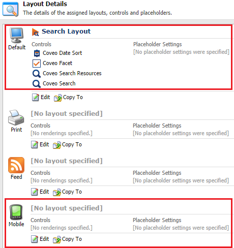
In the Sitecore Content Editor, select your Coveo-Powered Search Page.
-
Open its Layout Details (Presentation > Details).
-
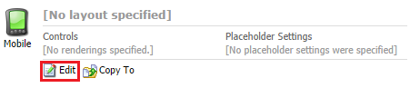
Next to the Mobile device, choose Edit.
-
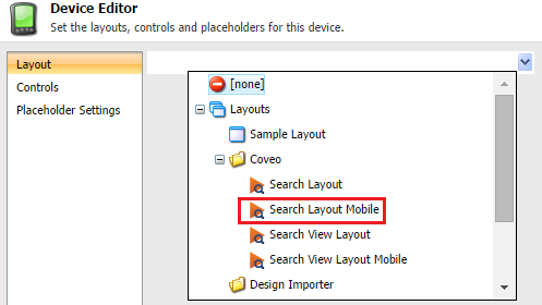
In the next screen (Device Editor), under Layout, select Search Layout Mobile.
-
Under Controls, add these two mandatory components and add them to the
coveo-searchplaceholder:-
Coveo Search Resources Mobile (
Sublayouts/Coveo/Coveo Search Resources Mobile). -
Coveo Search Mobile (
Sublayouts/Coveo/Coveo Search Mobile).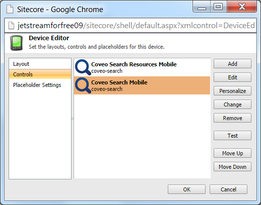 Note
NoteNote that if you use MVC controls, you need to use the Coveo Search View Resources Mobile and Coveo Search View Mobile, which are located under
Renderings/Coveo. The placeholder name iscoveo-search-mvc.
-
-
Preview your Coveo-Powered Search Page using the Page Editor (Publish > Preview).
-
In the Page Editor, choose the Mobile device.
-
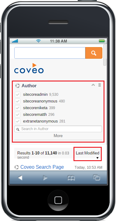
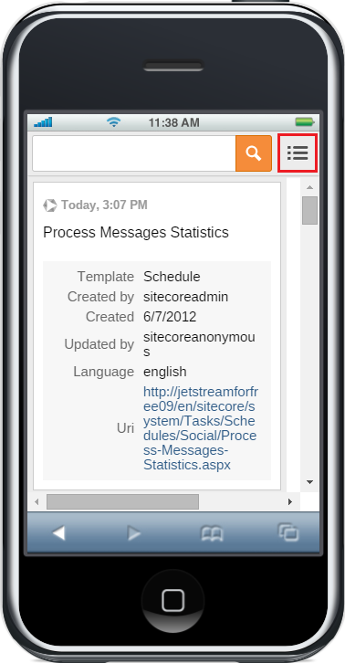
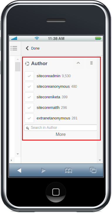
You can now see that the search interface looks quite different than when previewing it using the Default device. For example, there’s a collapsible panel on the right, which is used to hold the different Facet components.
-
From there, you can insert additional components such as Facet and Sort components, using either the Content Editor or the Page Editor; use whichever approach suits you best.
-
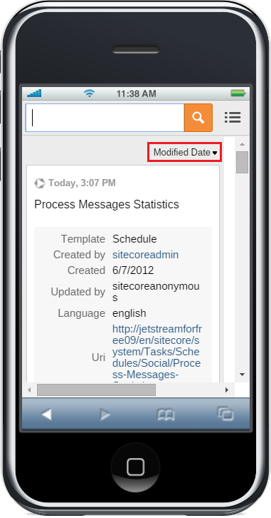
Finally, you can see that Sort components appear at the top of the search interface, while Facet components are located in the right side of the collapsible panel.
Customizing the Mobile Layouts and Sublayouts
Just like for the Search Layout and the sublayouts/components, you can customize their mobile counterparts.
-
Duplicate the sublayout or rendering (component) that you’re interested in (see Duplicating the Coveo Search Component).
-
Customize the
.ascxfile associated with your component (or its.cshtmlfile if you’re working with MVC views).
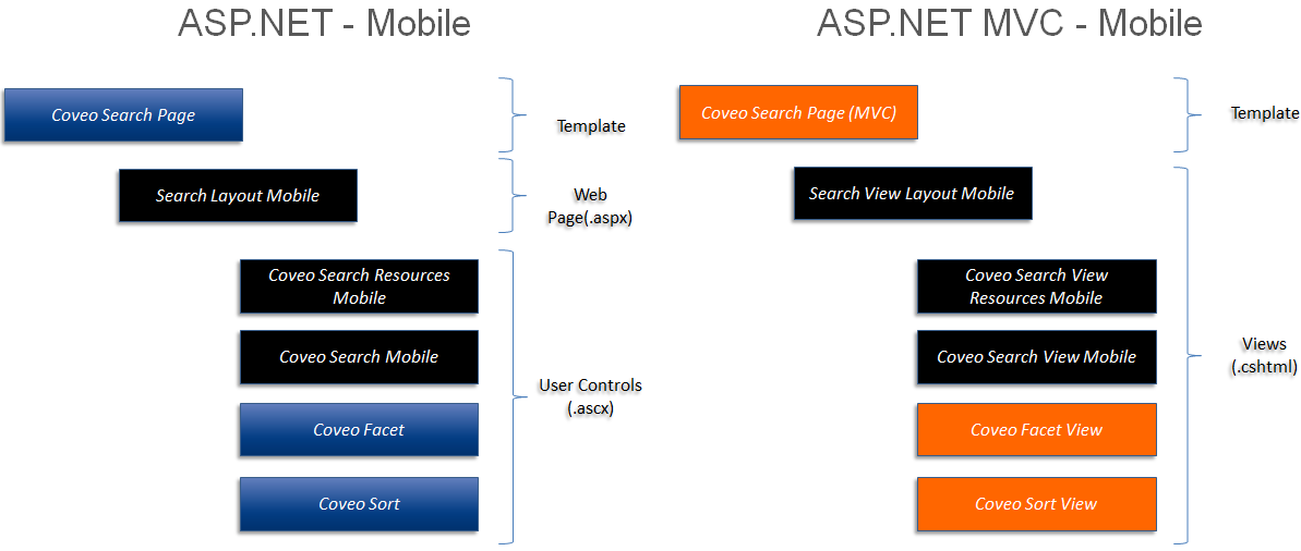
To understand which layouts/sublayouts and files you have to work with as a developer, see the following diagram, which compares mobile layouts and sublayouts, both in their ASP.NET and ASP.NET MVC versions. The blocks highlighted in black designate the layouts, sublayouts, and views that are specific to mobile devices. The other blocks are generic and can be used with both the Default and Mobile devices.