fields.json
fields.json
The fields.json file allows you to define experience options that can be used by business users to customize experiences.
This customization can be done without further developer assistance or changes to experience code.
For example, you might use this feature to enable a member of your merchandising team to change an experience’s banner image, image target, or banner text without having to change any experience code.
Basic specification
Here is a basic example specification:
Example:
{
  "groups": [
    {
      "id": "options",
      "title": "Experience options",
      "subtitle": "Local settings for your experience"
    }
  ],
  "fields": [
    {
      "key": "title",
      "type": "String",
      "label": "Title",
      "description": "Change the title of your banner",
      "required": true,
      "footnote": "Works best when kept to less than 150 characters",
      "groupId": "options"
    },
    {
      "key": "image",
      "type": "Image",
      "label": "Image",
      "description": "The banner image",
      "required": true,
      "groupId": "options"
    },
    {
      "key": "link",
      "type": "URL",
      "label": "Link",
      "description": "Where your banner links to",
      "required": true,
      "groupId": "options"
    },
    {
      "key": "behaviour",
      "type": "Boolean",
      "label": "Open in new page",
      "description": "If true, will open the link in a new page",
      "required": true,
      "groupId": "options"
    },
    {
      "key": "number",
      "type": "Number",
      "label": "Times",
      "description": "The number of times you want to show the banner",
      "required": true,
      "groupId": "options"
    }
  ]
}
Using groups
groups allow you to group inputs logically in the UI.
This is useful when there is a large number of fields.
A group is defined as an object:
{
  "id": message, // unique identifier for the group
  "title": message,
  "subtitle": "Choose your banner image"
}
Using fields
fields define the values you expect to receive when the experience is created.
Each field is defined as an object with the following keys:
{
  "key": "imageUrl", // Unique identifier for the field
  "type": "URL", // Determines what type of value is expected
  "label": "Image URL",
  "description": "Choose your banner image",
  // Text that displays beneath the specified field type to provide
  // context that cannot be put into the description key
  "footnote": "This field is required for your experience to work",
  "groupId": "banner", // Must be defined in `groups`
  "required": true // Whether the field is mandatory, false if omitted
}
The key in each field object is used as the key in the resulting options.data object when being referenced in the experience.
For example, if the user enters https://qubit.com/banner.png, when building the experience using the above template, you can access that value by:
module.exports = function variation (options) {
  console.log(options.data.imageUrl)
    // -> "https://qubit.com/banner.png"
}
Each field generates a different type of input depending on the chosen type:
-
String: Renders a text block if no constraints are added. With constraints a combo box is rendered. -
StringArray: Renders a multiple choice option. -
Image: Renders an image uploader. -
URL: Renders a text box. -
Number: Renders a number input. -
Boolean: Renders a checkbox. -
TimeRange: Renders two time inputs, saves the value as a delimited string 'mm:hh-mm:hh'. -
Duration: Renders a text box with a unit dropdown menu (containing days, hours, minutes and seconds). Saves the value as an object with keys 'units' and 'value' (for example,{ units: 'hours', value: 24 }).
Field constraints
Each field type has constraints. When creating an experience, the user must respect these constraints otherwise an error message will be shown in the UI.
The default constraints on each field are determined by the specified field type. Additional constraints are optional properties that can be passed to the field specification.
Default constraints
-
String: None -
Image: Fully formatted URI (for example, begins withhttp://orhttps://) -
URL: Fully formatted URI (for example, begins withhttp://orhttps://) -
Number: Integer or float number -
Boolean: None (will always be true or false from a checkbox) -
TimeRange: The nature of the field disallows any unwanted values. -
Duration: Number value must be non-negative.
If you wanted to limit the length of the string field to 100 characters, you could add maxLength, as shown in the following example:
Example:
{
  "key": "title",
  "type": "String",
  "label": "Banner Title",
  /* Required fields hidden for example */
  "constraints": {
    "maxLength": 100
  }
}
Available constraints
String
-
minLength: Minimum number of characters (integer, inclusive) -
maxLength: Maximum number of characters (integer, inclusive) -
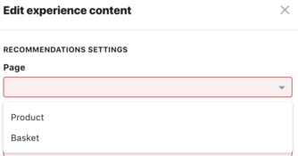
values: An enumerated array of {label, value} pairs that renders a text box as a combo box:
{
      "key": "page",
      "type": "String",
      "label": "Page",
      "groupId": "settings",
      "footnote": "which page the recommendations will show on",
      "required": true,
      "constraints": {
        "values": [
          {
            "label": "Product",
            "value": "product"
          },
          {
            "label": "Basket",
            "value": "basket"
          }
        ]
      }
    }
The above example would give us:

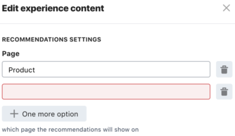
As an alternative, you could use the type StringArray.
The difference with this type is that the user is not restricted to the choices you provide in values, and can be used where you want to give the user the possibility to make multiple choices.
Using the above example as our base, we could modify it accordingly:
{
    "key": "page",
    "type": "StringArray",
    "label": "Page",
    "groupId": "settings",
    "footnote": "which page the recommendations will show on",
    "required": true
  }
This would give us:

Number
-
minimum: Minimum number value (float, inclusive) -
maximum: Maximum number value (float, inclusive) -
values: Similar to string values constraint above, but with float/integer value
Duration
-
minimum: Minimum number value (float, inclusive) -
maximum: Maximum number value (float, inclusive)