Diving into results
Diving into results
In this article, we’ll show you how to go deeper into your experience test results.
Getting started
The Overview tab is a great place to get top-level feedback on the impact an experience is having on visitors to your site and how the experiment is progressing against its defined goals–the finding presented at the top of the page gives you a clear indication of the result of the experiment against its primary goal:

Often, you’ll need to dive deeper into the data. To do that, select Results:

Typical use cases here include:
-
Connecting the data to specific periods of time over the lifetime of the experiment–perhaps you are looking to see changes in conversions over days when offline marketing campaigns were running or promotions
-
Which of the experience variations out-performed the control
-
Understanding how metrics such as Conversion Rate, uplift, and probability of uplift are derived
Viewing results in a graph and table
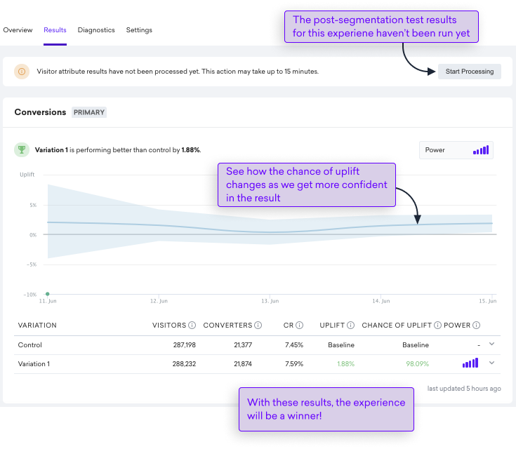
For each goal, you can dive into the data to see how each of your variations is performing against the control. We present the data in graph and table format. Within the table, you can also go deeper into the data by looking at the performance of each variation.
Viewing results in a graph
Let’s take a look at the data in graph format and how to interpret the visuals:

Credible interval
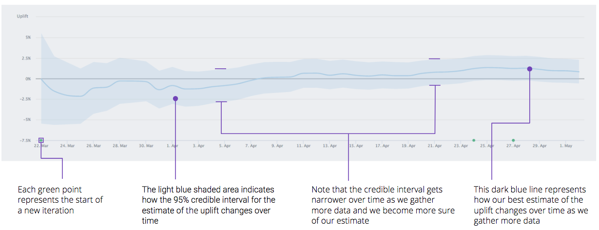
The light blue shaded area around the darker blue estimate line represents the credible interval. This is the potential range for the effect size.
Early on in the test, this range is very wide and tends to fall both sides of the 0% line, indicating that the underlying effect could be positive or negative.
As the test proceeds and the sample size increases, this range will tend to narrow as we become more sure of the actual effect. If the test reaches 100% sample size and the lower part of this shaded area is above the 0% line, then the test is declared a statistically significant winner and will have an uplift probability of 95% or more.
Uplift and probability over time
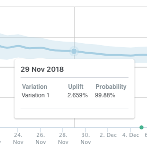
By positioning the cursor over the line, you can view the uplift and probability of uplift for each variation at that particular point in the history of the experience:

Tips for interpreting the graph
-
Pay more attention to the light blue shaded area, representing the credible alternative, than the dark blue estimate line
-
It’s normal for the dark blue line, representing our best estimate of uplift, to shimmy above and below the horizontal gray line, which represents the control, until the credible interval is more robust
-
If the credible interval’s lower bound is above 0, the experience will have a probability of uplift of greater than 95%
Viewing results in a table
The table below the graph provides an additional level of detail about your control and variations, showing the number of visitors exposed, the number of convertors, Conversion Rate, estimated uplift, and uplift probability Let’s take a look at an example:

To expose the data for each iteration, select  :
:

A quick note on the Conversion Rate
The reported headline Conversion Rate for the control and variation is derived from Qubit’s statistical model, and represents the best estimate of the Conversion Rate, based on the activity it has seen, whereas the Conversion Rate reported for each iteration is derived from raw data for the experience.
For this reason, it is possible that the Conversion Rate % will not correspond to the value obtained manually from visitors and converters.
We can see this in the following example, which shows a Conversion Rate of 17.85%, which differs by 0.21% from the value obtained manually (18.06%):

For more information about how Qubit generates results, see Testing & Evaluating Experiences.
Next steps
Unless the entire uplift range falls entirely above or below the 0% line, little can be said conclusively about the relative performance of the variations. The next steps are to work with your strategist to consider new hypotheses. Consider also reviewing the tests to see if you can create more meaningful ones.
At Qubit, we recommend bringing together your hard-earned experience with some robust data analysis to come up with strong hypotheses for A/B tests. This approach is far more likely to lead to successful experiences and drive long-term incremental revenue than a scattergun approach. As an added bonus, you’ll also complete tests more quickly, enabling you to move on to your next big idea.
We also have a number of dedicated exports that you can generate to further understand your experiences and their impact. See Exporting Your Data for more information.