Badging (for PLPs)
Badging (for PLPs)
Select the page type and product source
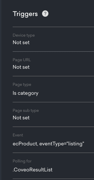
In the Placement creation wizard, select category as your page type and Listing as your product source.

Set up your triggers
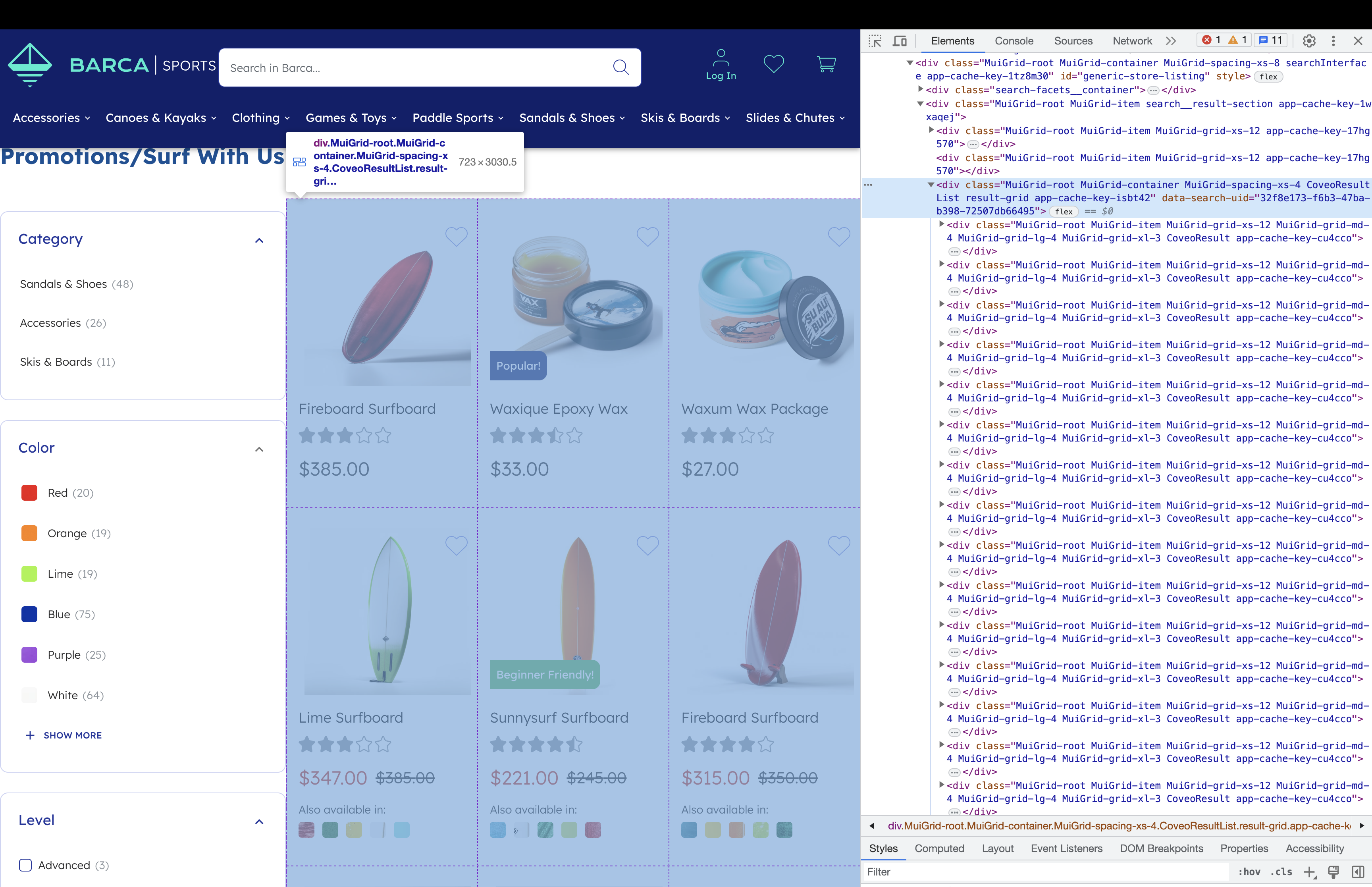
Next, find a way to target exactly the element which contains the listing results. In this case, you should use the CSS selector .CoveoResultList:

Make sure you add that element on the Simple triggers page, in the Polling for section. For more information about triggers, see Placement settings.

The event above has been set to ecProduct, eventType="listing" because the listing product source was selected in the first step.
We expect these QProtocol events in the below format to identify products that are candidates for badging:
uv.emit('ecProduct', {
  eventType: 'listing',
  product: {
    productId: 'product1'
  }
})
Define your sample payload
The Placement schema already includes the message and an imageUrl fields, one of which will need to be defined for a campaign to run.
|
|
Note
You can add custom fields to your schema to give merchandisers additional control over the Placement’s design. For more details, see Schemas. |
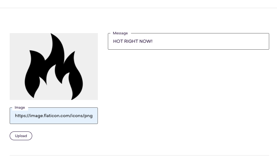
You can set your sample payload by filling out the fields on the Placement Content page:

The sample payload will look like this:
{
  "message": "HOT RIGHT NOW!",
  "imageUrl": "https://image.flaticon.com/icons/png/512/91/91381.png"
}|
|
Note
If you’re using Qubit CLI to develop locally, you’ll need to save the Placement in the UI and pull its new structure to your local project at this point. |
Write some code!
This is what your placement.js file will look like at first:
module.exports = function renderPlacement ({ content, onImpression, onClickthrough }) {
  if (content) {

  } else {

  }
}
To start with, you have to import preact and @qubit/utils, a library that offers some helpful tools for manipulating the DOM.
Next, you should use onRemove and elements (two other arguments available for us in the renderPlacement function) which you can read more about in placement.js arguments.
const React = require('preact')
const {
  style,
  insertBefore,
  onEvent,
  onEnterViewport,
  restoreAll
} = require('@qubit/utils/dom')()

module.exports = function renderPlacement ({
  content,
  onImpression,
  onClickthrough,
  onRemove,
  elements
}) {
  // ...
}
As you can see in the boilerplate code, you’ll divide our code into two parts, content and no-content. However, there are a couple of things you need to do before getting into that split to avoid creating bias in our test:
// The functions provided by @qubit/utils are all linked to the `restoreAll` function,
// which means that when you remove the Placement on the page with `onRemove` (particularly useful for single-page applications),
// it will clean it up after itself and avoid leaking side effects.
onRemove(restoreAll)

// Appending this element to the same spot on the DOM for both control and variant will ensure the test is fair.
// Check out the Impressions and clickthroughs guide in the docs to learn more about this.
const element = document.createElement('div')
insertBefore(target, element)

// Emitting onImpression before branching into control/variant prevents bad splits
onEnterViewport(element, onImpression)
You can now implement the placement itself. You have to start with the following skeleton template for placement.js, which will suit most use-cases, and each missing part will be filled for you:
const React = require('preact')
const {
  style,
  appendChild,
  onEvent,
  onEnterViewport,
  restoreAll
} = require('@qubit/utils/dom')()

function renderPlacement({
  content,
  elements: [plpContainerElement],     // use `plpContainerElement` for the impression event
  onImpression,
  onClickthrough,
  onRemove,
  meta: { placementId }                // Use `placementId` for your class names
 }) {
  onRemove(restoreAll)
  onEnterViewport(plpContainerElement, onImpression)

  // 1. Scrape for the list of all products on the page
  const productElements = [] // for example, document.querySelectorAll('.my-products')

  // 2. Register clickthrough events
  for (const productEl of productElements) {
    // 2.1 Scrape for all the clickables within the product card that constitute a clickthrough
    const productLinks = [] // for example, productEl.querySelectorAll('a, button')

    // 2.2 Register events
    for (const link of productLinks) {
      onEvent(link, "click", onClickthrough)
    }
  }

  if (content) {
    for (const productEl of productElements) {
      // 3. Extract the badge content
      const badgeContent = null
      if (badgeContent) {
        // 4.1 Inject placement into the DOM
        // 4.2 Also, register product impressions and product clickthough
      }
    }
  }
}
Step 1: Scrape for the list of all products on the page
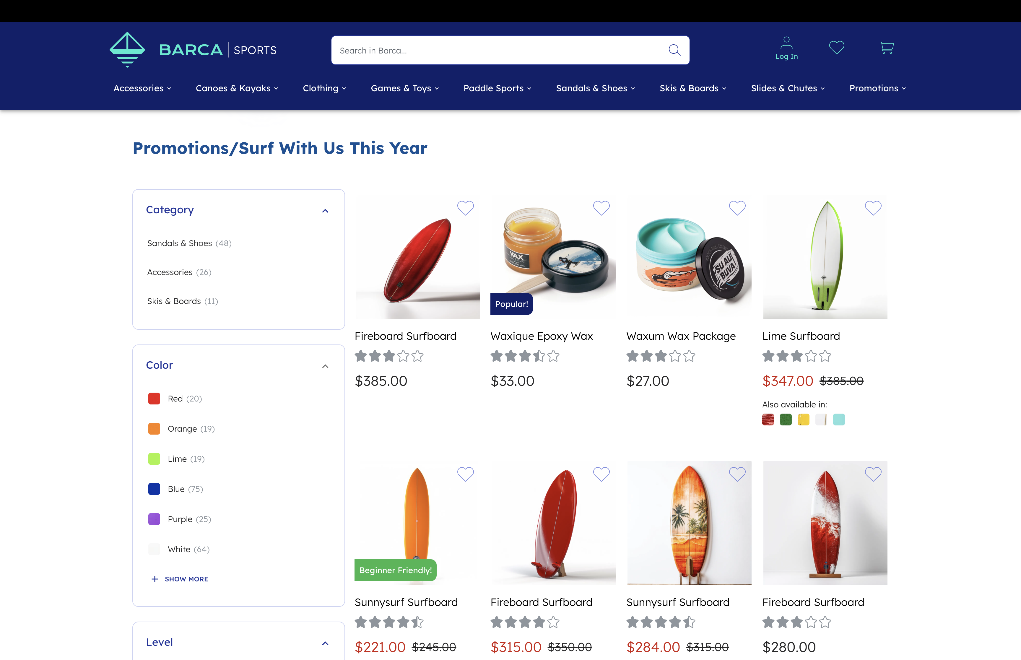
In order to apply the badges returned by the {Content API}, you’ll need to find the elements containing the products displayed in the PLP.
It’s important to replace the declaration of productElements so that it contains all the relevant elements, like in the code sample below:
const productElements = document.querySelectorAll('.my-products')Step 2: Register clickthrough events
In order to track conversion, you’ll need to register clickthrough events. Here is an example of how to implement this:
for (const productEl of productElements) {
  // 2.1 Scrape for all the clickables within the product card
  // Note: sometimes, you will want to exclude certain buttons or links, for example
  // in the case of "Quick view" buttons which do not constitute a clickthrough when clicked.
  const productLinks = productEl.querySelectorAll('a, button')

  // 2.2 Register the events
  for (const link of productLinks) {
    onEvent(link, "click", onClickthrough)
  }
}
Step 3: Extract the badge content
While iterating over the products displayed on the page, you have to check if the {Content API} has returned content to be badged for each product. It’s recommended to create a utility function to do this, like in the example below:
// This function takes in the `content` object and the product ID to check.
// If there's a badge associated with the given product, the badge content will be returned.
// Otherwise, `null` is returned.
function getBadgeContent(content, productID) {
  const arr = content.badges[productID]
  return arr && arr.length
    ? arr[0]
    : null
}
You can then use this to determine the badge content associated to each product, for example:
// Adapt this line so that it extracts the product ID of the given product element
const productID = productEl.getAttribute("product-id")
const badgeContent = getBadgeContent(content, productID)
Step 4: Render the placement!
If the {Content API} successfully returns badge content for the current product, you can now render a badge for that product. This will vary depending on the DOM of your website and on the specifics of your use-case, but here is a general example of the JavaScript code you can use to deploy the badge:
// Here you use destructuring to get our content from the `content` object
const { message, imageUrl } = content

const target = document.createElement('div')
React.render(
  // Note that you will use these classNames to style our badge in placement.css
  <div className="PLP-badge">
    {image && <img className="PLP-badge-image" src={image}/>}
    {message && <p className="PLP-badge-message">{message}</p>}
  </div>,
  // You are rendering this badge inside the newly created target element
  target
)

// Insert the target element in the DOM. Change this so it appears in the correct location in your page.
appendChild(productEl, target)
Step 5: Add styling
Lastly, you have to modify your placement.css to style the badge according to your needs. Don’t worry about importing it since it’s already bundled together with your placement.js file.
.PLP-Badge {
  position: absolute;
  display: grid;
  grid-template-columns: 30px 1fr;
  top: 80%;
  left: 50%;
  transform: translateX(-50%);
  padding: 10px;
  background-color: white;
}

.PLP-Badge-image {
  margin-right: 13px;
}

.PLP-Badge-message {
  color: black;
  margin: auto;
  margin-left: 13px;
}