Report cards
Report cards
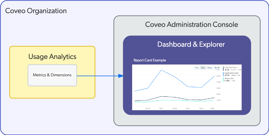
report cards allow you to visualize specific user activity dimensions and metrics logged in your Coveo organization. You can create various types of cards and assemble them in a dashboard using the Coveo Administration Console.
Report card types
The following section contains the types of Coveo Analytics report cards available to use in dashboards or explorers.
|
|
Note
Most card types can only be added to a dashboard, except for the metric time series card and the table card, which can also be added to an explorer. |
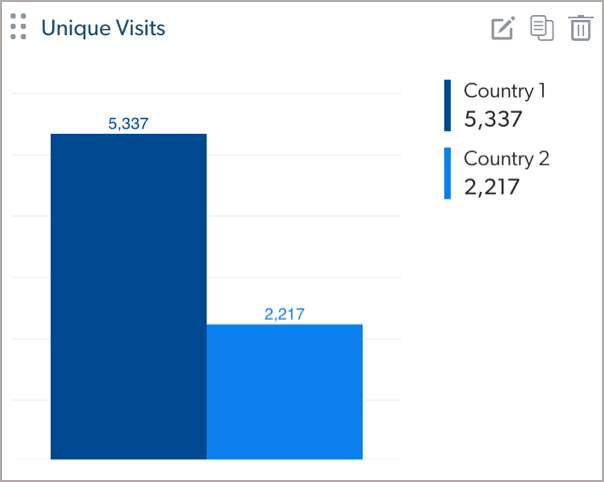
Bar chart
A graphical card that presents the value of one metric for each value of a dimension on horizontal or vertical bar chart. For more information on adding a bar chart to a dashboard, see Add and review pie and bar chart cards.
Calculated metric
A numerical card that presents the results of an arithmetic operation (+, -, *, /) between metric card values or with a fixed numeric value. For more information on adding a calculated metric card to a dashboard, see Add calculated metric cards.
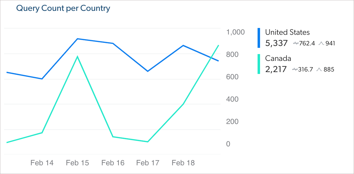
Dimension time series
A line or bar chart that presents the metric values for one dimension over a period of time, with selectable time intervals (hour, day, week, month). For more information on adding a dimension time series card to a dashboard, see Add dimension time series cards.
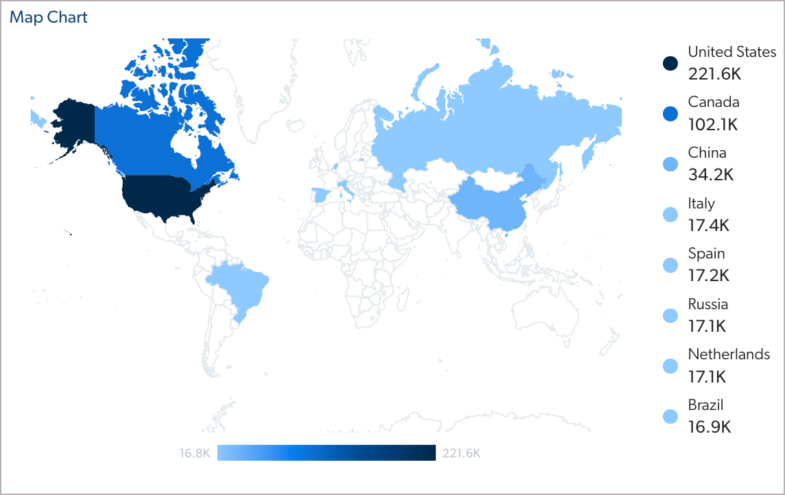
Map
A real world map in which shades of orange represent the value of a metric for events originating from each country. For more information on adding a map card to a dashboard, see Add map cards.
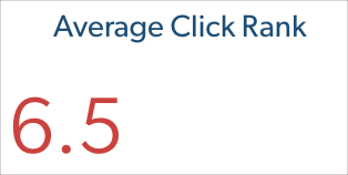
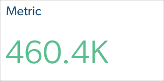
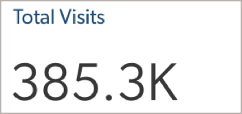
Metric
A simple numerical card that displays the metric name, its value, and units when applicable. For more information on adding a metric card to a dashboard, see Add metric cards.
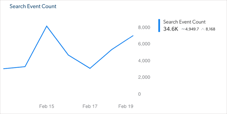
Metric time series
A line or bar chart that presents the values of one or more metrics over a period of time, with selectable time intervals (hour, day, week, month). For more information on adding a metric time series card to a dashboard or an explorer, see Add metric time series cards.
Note
A textual card in which you can enter text such as notes and optionally include a warning icon. For more information on adding a note card to a dashboard, see Add note cards.

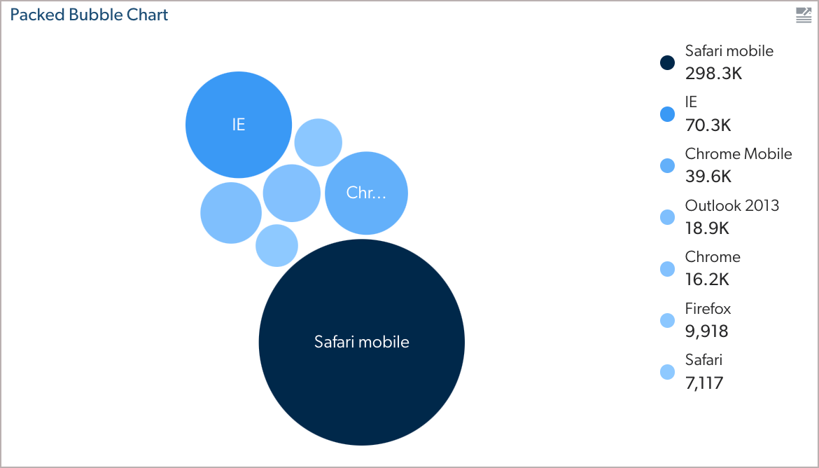
Packed bubble chart
A graphical card in which the size and shape of a bubble represent the value of one metric for each value of a dimension. For more information on adding a packed bubble chart card to a dashboard, see Add packed bubble chart cards.
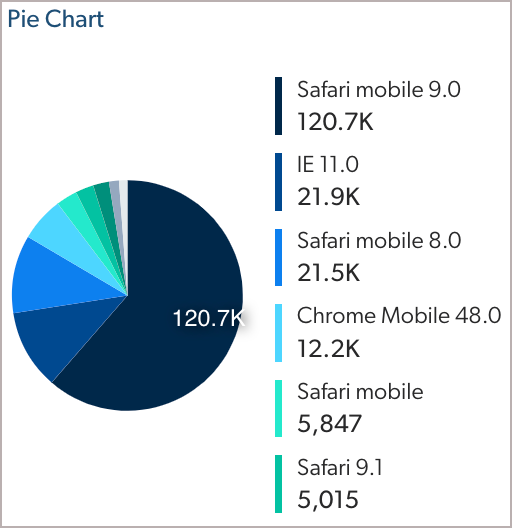
Pie chart
A graphical card that presents the value of one metric for each value of a dimension on a pie or donut chart. For more information on adding a pie chart card to a dashboard, see Add and review pie and bar chart cards.
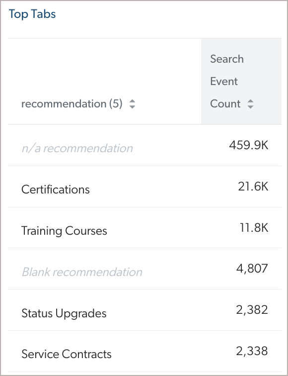
Table
A tabular list of one or more dimensions and their metrics. For more information on adding a table card to a dashboard or an explorer, see Add table cards.
Trend
A tabular list of one dimension and its associated metric value indicating the difference compared with the previous period. For more information on adding a trend card to a dashboard, see Add trend cards.
Visit metric
A simple numerical card that displays the visit metric name and the number of visits (unique, clickthrough, visits with clicks, or visits with a manual search event, for a specific event). For more information on adding a visit metric card to a dashboard, see Add visit metric cards.
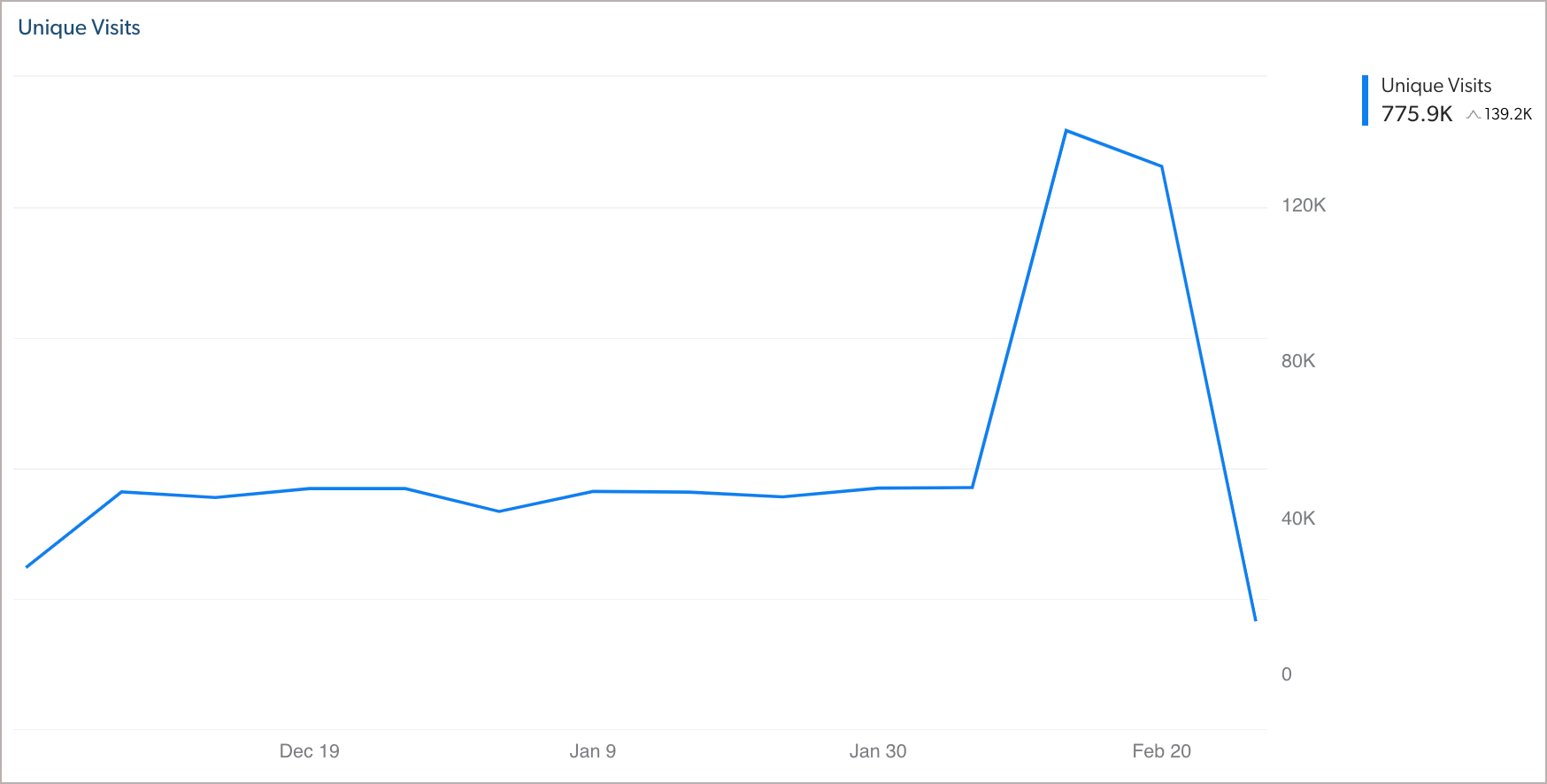
Visit metric time series
A line or bar chart that presents the values of one or more visit metrics over a period of time, with selectable time intervals (hour, day, week, month). For more information on adding a visit metric time series card to a dashboard, see Add Visit metric time series cards.
What’s next?
Once you know why you should use each card, you can add these to your dashboards (see Add dashboards).