Review trends from the Summary dashboard
Review trends from the Summary dashboard
- Access the "Summary" dashboard in Edit mode
- Review the available graphical and numerical metrics
- Review the available dimension values to evaluate search interface activity and results relevance
- Set the date interval in which you want to review your data
- Add one or more dimension filters to refine your data
- Required privileges
The Summary dashboard is divided into the four following sections: Activity, Keywords, Relevancy, and Content Gaps.
You can use this report to review the search activity, evaluate the search relevance, and identify the content gaps of your search.
The purpose of the Coveo Administration Console Summary dashboard is to provide a quick overview of various search metrics, such as Search Event Count, Search Event Clickthrough, and Average Click Rank, for selectable date intervals such as Last week or Last month. Lists of the top user queries and keywords with low relevance and without results provide valuable information that can be quickly reviewed on a regular basis to help you identify usage trends and anomalies to determine when further analysis is required.
Access the "Summary" dashboard in Edit mode
-
Log in to Coveo (platform-ca | platform-eu | platform-au) as a member of a group with the required privileges to manage reports in the target Coveo organization, if not already done.
-
In the main menu on the left, under Analytics, select Reports.
 Note
NoteThe following message appears on the page when Coveo Analytics isn’t activated for your Coveo organization. Contact Coveo Support to activate Coveo Analytics for your Coveo organization:
This section is not available for your organization. -
On the Reports (platform-ca | platform-eu | platform-au) page, click the Summary dashboard, and then click Open in the Action bar.
NoteThe Summary dashboard is provided by default in any Coveo organization. This dashboard could be deleted, renamed, or modified. If missing, you can recreate the report using the Summary template.
-
In the Summary dashboard, click Edit in the upper-right corner.

Changes that you made prior to accessing Edit mode are kept. Therefore, you must remove these changes (if unwanted) before saving the report.
Review the available graphical and numerical metrics
-
In the Summary dashboard, inspect the available metric values.
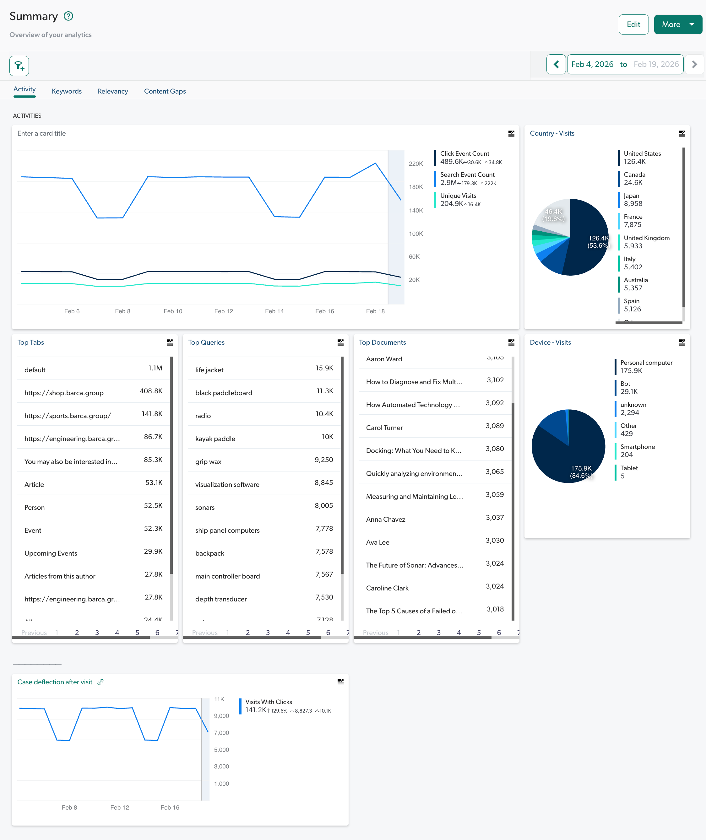
The "Activity" tab
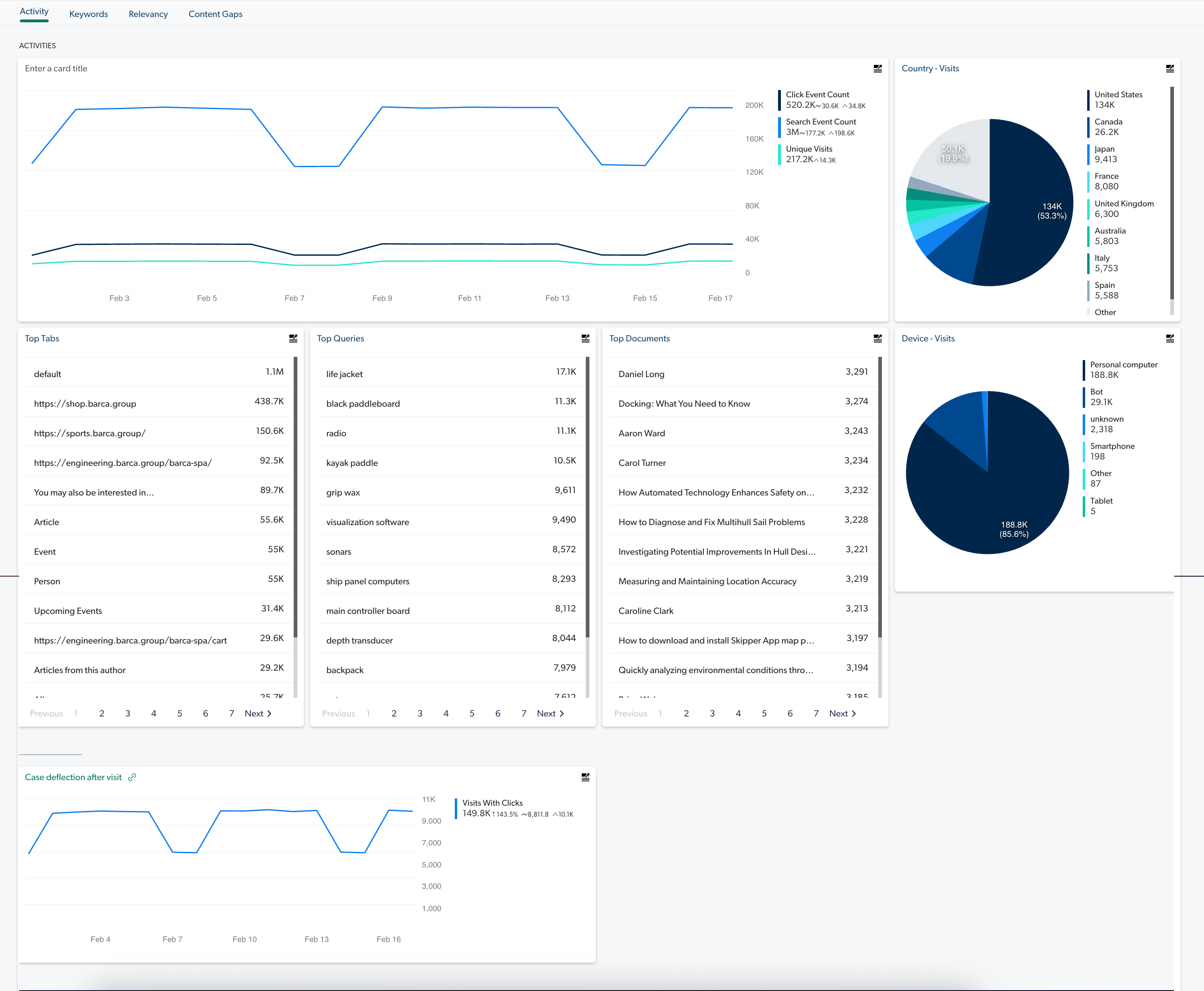
The time series graph in this tab reports three metrics over time.
When evaluating adoption, their trend going up indicates that search usage is increasing.
Click Event total
The first line of the graph shows the number of clicks per day for the selected date range and filters.
The numerical values on the right side show the Click Event Count total, daily average, and peak (highest number of clicks during a day) click for the selected period.
Search Event total
The second line of the graph is similar to the Click Event Total one, but rather reports search count.
Unique Visits
The third and last line of time series graph shows the number of unique visits (based on IP addresses and user names) per day for the selected date range and filters.
The numerical values on the right side show the total of unique visits and the peak (highest number of unique visits during a day) for the selected period.
The "Keywords" tab
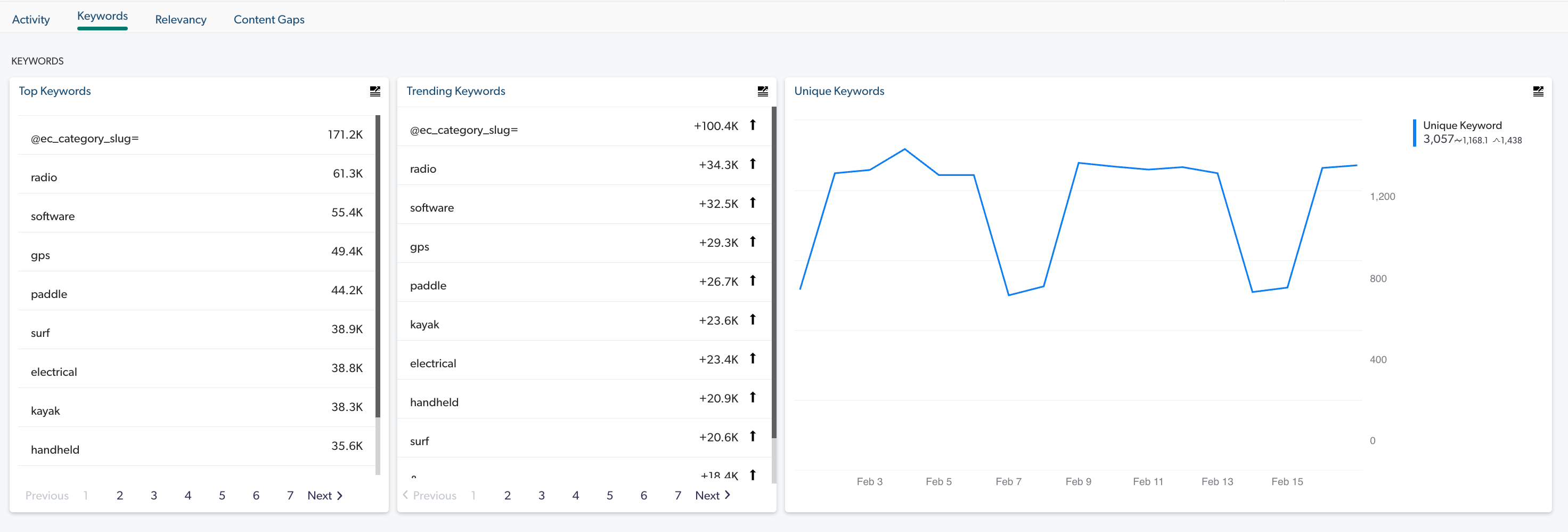
Unique Keywords
This time series graph shows the number of unique keywords per day for the selected date range and filters.
The numerical values on the right side show the Unique Keywords total, daily average, and peak (highest number of unique keywords during a day) for the selected period.
The "Relevancy" tab
Average Click Rank over time
This time series graph shows the average position of clicked items in the search results for the specified date range and filters.
Average Click Rank values are greater than 0.
Lower values are better.
A value of 1 would mean that users always open the first item in the search results list.
A value of 10 and over should be investigated.
The numerical values on the right side show the average of all daily averages and the peak (highest average click rank during a day) for the selected period.
|
|
Note
The average of all daily averages can be under |
Clickthrough over time
This time series graph shows the percentage of queries with at least one click on search results per day for the specified date range and filters.
Clickthrough values are between 0 and 100.
Higher values are better.
The numerical values on the right side show the average of all Search Event Clickthrough (%) daily averages and the peak (highest search event clickthrough during a day) for the selected period.
When evaluating adoption, the trend going up indicates that search usage is increasing.
The "Content Gaps" tab
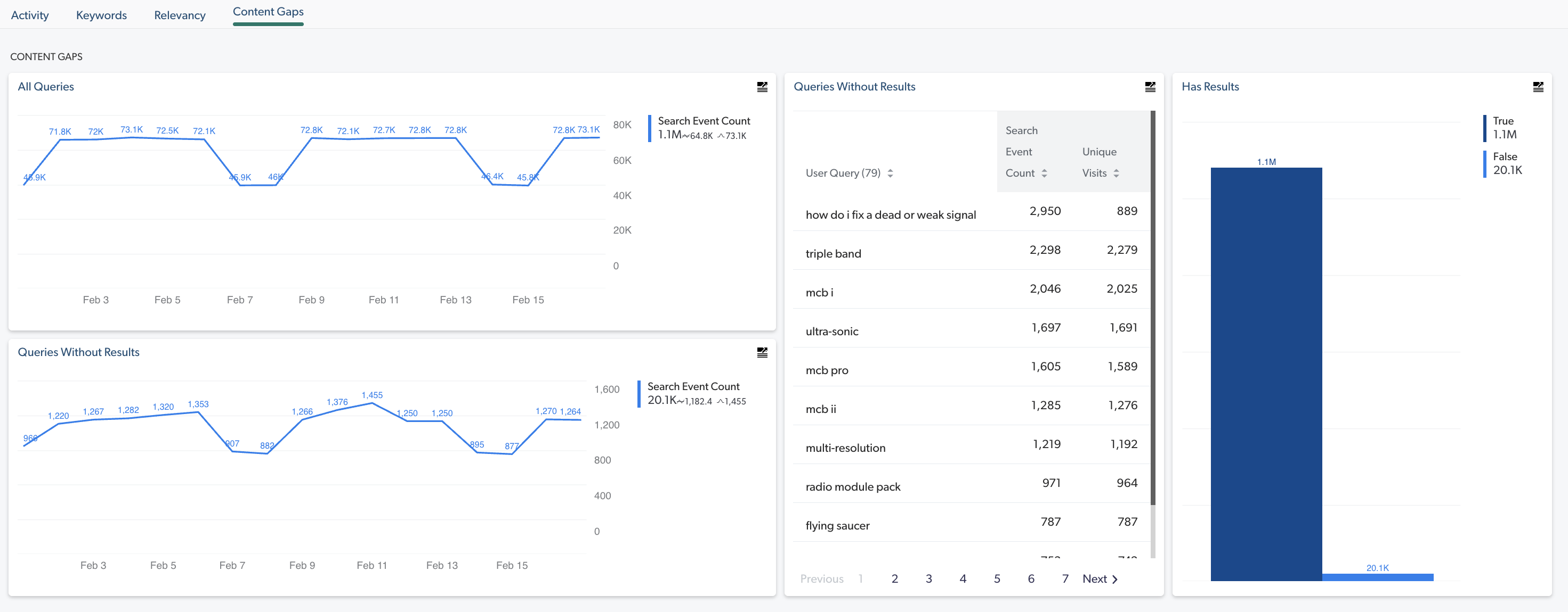
All queries
This time series graph displays the number of search events per day that were not empty or n/a for the selected date range and filters.
The numerical values on the right side show the Search Event Count total, daily average, and peak (highest number of queries during a day) appear for the selected period.
Queries without results
This time series graph displays the number of search events that didn’t return anything in the search results list.
The numerical values on the right side show the total of search events returning no results, daily average, and peak (highest number of search events not returning results during a day) for the selected period.
When improving knowledge management and content coverage, the trend should go down.
Review the available dimension values to evaluate search interface activity and results relevance
-
In the Summary dashboard, inspect the available dimension values.
The Summary dashboard tabs show different lists and charts, such as the most frequently submitted queries and keywords, and the most active countries/search interfaces.
The "Activity" tab
Country - Visits
This pie chart helps you outline usage as a function of the users' location based on the number of visits in each country for the selected date range and filters.
You can use the Country dimension to evaluate the adoption per country. Low adoption could be because of an improper search solution localization.
Device - Visits
This bar chart helps you outline usage as a function of the users' device category based on the number of visits for the selected date range and filters.
You can use the Device Category dimension to evaluate adoption variation as a function of the device category used to search. A low adoption for tablet or phone users may indicate poor user experience on these devices or suggest that optimizing mobile version of the search pages isn’t required because of a low number of visits on these devices.
Top Tabs
This list helps identify the name of the most popular search interfaces from which any type of events are performed. Typically, search interfaces have different URLs.
Top Queries
This list helps identify what people are searching for the most. Ensure that your search page returns relevant results when those queries are performed.
Top Documents
This list helps identify potential relevance issues, because this list highlights the most popular items based on the number of visits in which these items were clicked. You can then investigate whether these items appear on top of the results list when queries containing related keywords are performed.
The "Keywords" tab
Top Keywords
This list helps identify what people are searching for the most.
Trending Keywords
This list helps identify potential relevance issues, because this list highlights keywords becoming more popular compared to the same previous period (week, month…) based on the number of unique visits in which these keywords were contained in performed queries. You can then investigate whether these keywords are returning relevant results.
The "Relevancy" tab
Queries With Low Relevance
This list helps identify relevance issues, because this list highlights popular queries with a low Relevance Index (which means high Average Click Rank values among other things).
The "Content Gaps" Tab
Queries Without Results
This list helps identify content gaps, because these user queries return no results.
Has Results
This bar chart helps identity the proportion of queries returning results (True) versus queries not returning results (False).
Set the date interval in which you want to review your data
-
In the Summary dashboard, in the upper-right corner of the report, you can quickly go from the actual date interval selected (last week, month…) to the previous or next period by clicking
 and
and  respectively or you can click the box containing the actual date range (for example,
  - by default the last 7 complete days) to access the Report Period dialog, and then select the date range you want to review.
Note
- by default the last 7 complete days) to access the Report Period dialog, and then select the date range you want to review.
NoteYou can select a period that’s incomplete (for example, the current month), in which case your date range selection will always include the latest available events until the period ends (for example, the first day of the following month).
For example, you’re reviewing data per Month and want to see how statistics are trending for the first two weeks of the current month, so you click
.
Add one or more dimension filters to refine your data
-
In the Summary dashboard, access the dialog to add global dimension filters by clicking
 in the upper-left corner.
Required privileges
The following table indicates the required privileges to view and edit dashboards from the Reports (platform-ca | platform-eu | platform-au) page and associated panels (see Manage privileges and Privilege reference).
|
|
Note
Access to dashboards or part of their content may be further restricted as a function of the member (see Manage access to reports and Manage permission filters). |
| Action | Service | Domain | Required access level |
|---|---|---|---|
View the Summary dashboard |
Analytics |
Analytics data |
View |
Dimensions |
View |
||
Named filters |
View |
||
Permission filters |
View |
||
Reports |
View |
||
Organization |
Organization |
View |
|
Edit the Summary dashboard |
Analytics |
Administrate |
Allowed |
Analytics data |
View |
||
Data exports |
Edit |
||
Dimensions |
View |
||
Named filters |
View |
||
Permission filters |
View |
||
Reports |
Edit |
||
Organization |
Organization |
View |