Add packed bubble chart cards
Add packed bubble chart cards
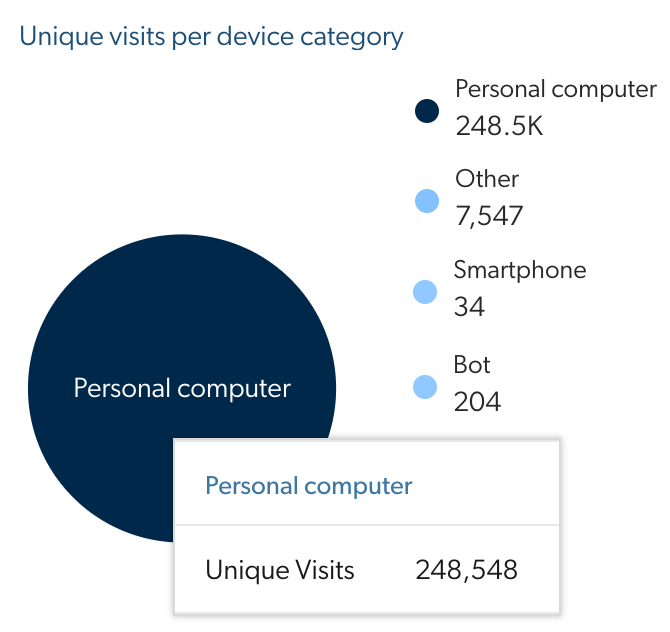
Coveo Analytics dashboards offer many ways to review the data collected by Coveo Analytics. You can add packed bubble chart cards to dashboards to visualize the significance of different dimension values based on a chosen metric.
For example, you can create a packed bubble chart card representing the number of visits per device category.
Add a packed bubble chart card to a dashboard
-
In an existing dashboard, access Edit mode by clicking Edit in the upper-right corner.
 Note
NoteIn a new dashboard, the report is in Edit mode by default (see Add dashboards).
-
In a section, click Add card to section to access the Add a card dialog.

You can also duplicate an existing card with
 , and then only modify what needs to be different.
 -
In the Add a card dialog:
-
Select Packed bubble chart.
-
In the first input, enter a meaningful Card title.
NoteWhen you leave the box empty and save the dashboard, the card title will be [Selected Metric] per [Selected Dimension] (for example, Device Category per Unique Visits).
-
Under Dimension and Metric, click the dropdown menu, and then select a dimension and a metric to be shown in the table by doing one of the following:
-
Click the links (Search, Click, and Custom) to quickly browse dimensions and metrics by event category, and then select the ones of your choice (see Dimensions and Metrics).
-
Click All, and then use the Filter box to find and select the dimensions and metrics of your choice.
Notes-
The selected metric determines the size of the bubbles.
-
For better results, select a dimension that has many values (for example, Country, Browser, Document Title).
-
-
-
(Optional) In the Advanced settings section:
-
Click
 , and then create one or more dimension filters, (for example
 Device Category is not blank or n/a). -
When you report on a custom event and on a search or click event (you added a filter or selected a dimension or metric related) at the same time, or on an all event category metric or dimension (for example, Unique User IP and Browser), choose to Create a relation using the Last search or the Visit between the event categories.
Select Last search in situations where the last query performed by the user is the reason for the custom event.
For example, in Salesforce, when agents attached a result to a case (
caseAttach), the last query they made gave them the results they used to do the custom event.On the other hand, select Visit in situations where none of the queries performed by the user during the visit resolved their matter.
For example, when one of your clients creates a case (
caseCreate) usually tried to get the information they needed by querying on the subject of their matter before doing the custom event. You can then use these queries to create knowledge base articles and fill the content gap.
Notes-
Custom data can only be leveraged when using the Coveo UA Protocol. If your Coveo implementation uses the Event Protocol, custom event types shouldn’t be added to a report since they won’t function as expected.
-
The Create a relation using parameter has no effect when you report only on search and click events.
-
Last search links each custom event to the query immediately preceding (if any) and Visit links each custom event to all queries performed during the user visit in which the custom event happened.
-
-
-
Click Add card.
-
-
Back on the dashboard, click Save in the upper-right corner.
|
|
Notes
|
Review packed bubble chart card content
-
On the Reports (platform-ca | platform-eu | platform-au) page, click the report containing the packed bubble chart cards you want to review, and then click Open in the Action bar.
-
For every packed bubble chart cards, you can:
-
See the metric count for each country and the percentage that this count represents on the metric total count by hovering over a circle of the packed bubble chart card.
-
Filter the report by only keeping the data of a country by clicking a country in the packed bubble chart card.
-
Add or remove a dimension value from the packed bubble chart by hovering over a value in the chart legend and then clicking Hide/Show.
-
Highlight the part of the packed bubble chart representing a dimension value by hovering over a value in the chart legend.
-
Required privileges
The following table indicates the required privileges to view and edit dashboards from the Reports (platform-ca | platform-eu | platform-au) page and associated panels (see Manage privileges and Privilege reference).
Access to dashboards or part of their content may be further restricted as a function of the member (see Manage access to reports and Manage permission filters).
| Action | Service | Domain | Required access level |
|---|---|---|---|
View dashboards |
Analytics |
Analytics data |
View |
Dimensions |
View |
||
Reports |
View |
||
Organization |
Organization |
View |
|
Edit dashboards |
Analytics |
Administrate |
Allowed |
Analytics data |
View |
||
Dimensions |
View |
||
Reports |
Edit |
||
Organization |
Organization |
View |