Add metric time series cards
Add metric time series cards
Coveo Analytics dashboards offer many ways to review the data collected by Coveo Analytics. You can add metric time series cards to dashboards to evaluate metrics over a certain period.
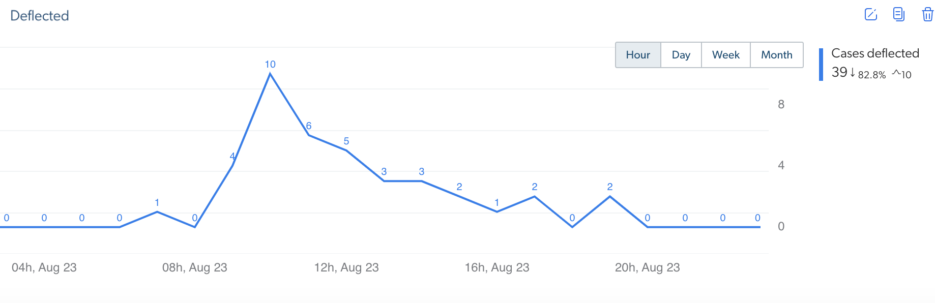
You can create a time series that presents the number of cases that were deflected over the past few days.
Add metric time series cards to dashboards
-
In an existing dashboard, click Edit in the upper-right corner to access Edit mode.
 Note
NoteIn a new dashboard, the report is in Edit mode by default.
-
In a section, click Add card to section to access the Add a card dialog.

You can also click
 to duplicate an existing card with, and then only modify what needs to be different.
 -
In the Add a card dialog:
-
Select Metric time series.
-
In the first input, enter a meaningful Card title, for example,
Cases Deflected Over the Past Six Days.
NoteWhen you leave the input empty and save the dashboard, the card title will be Metric Time series.
-
Under Metrics, click the dropdown menu, and then select at least one metric to be shown in the metric box, for example Custom Event Count. To do so, perform one of the following tasks:
-
Click the links (Search, Click, and Custom) to browse metrics by event type, and then select the ones of your choice (see Metrics).
NoteCustom data can only be leveraged when using the UA Protocol. If your Coveo implementation uses the Event Protocol, custom dimensions and metrics shouldn’t be added to a report since they won’t function as expected.
-
Click All, and then use the Filter box to find and select the metrics of your choice.
NoteYou can add up to five metrics per graph.
-
-
(Optional) In the Advanced settings section:
-
Click
 , and then create one or more dimension filters, for example,
 Event Value is caseCreate. -
When you want to see trend data relative to the previous period equivalent to the currently selected one, select the Display trend data option.
The trend value appears next to the metric value as a percentage with an up or a down arrow respectively indicating an increasing or a decreasing trend.
The option is turned off by default, because calculating the trends increases the dashboard complexity and slows down the dashboard generation. Enable this option when you find the trend information useful.
-
When you want to see metric values on top of every time series points, select the Display metric data option.
-
Under Data display, select the time series to be shown using Line or Bar charts.
-
When you report on a custom event and on a search or click event (you added a filter or selected a metric related) at the same time, or on an all event category metric or dimension (for example,
Unique User IPandBrowser), choose to Create a relation using the Last search or the Visit between the event categories.
Select Last search in situations where the last query performed by the user is the reason for the custom event.
For example, in Salesforce, when agents attached a result to a case (
caseAttach), the last query they made gave them the results they used to do the custom event.On the other hand, select Visit in situations where none of the queries performed by the user during the visit resolved their matter.
For example, when one of your clients creates a case (
caseCreate), they likely tried to find the information they needed by querying on the subject of their matter before creating the custom event. You can then use these queries to create knowledge base articles and therefore fill the content gap.
Notes-
The Create a relation using parameter has no effect when you report only on search and click events.
-
Last search links each custom event to the query immediately preceding (if any) and Visit links each custom event to all queries performed during the user visit in which the custom event happened.
-
-
-
Click Add card.
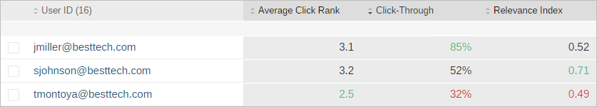
NoteRelevance metrics (Average Click Rank, Search Event Clickthrough, and Relevance Index) values (if any) have a color that represents if the value is good (green), neutral (black), or poor (red) depending on predefined thresholds.
The predefined thresholds for each metric are the following:
-
Average Click Rank: 1-3 = good (green), 3-6 = neutral (black), and > 6 = poor (red)
-
Search Event Clickthrough: > 60% = good (green), 40-60% = neutral (black), and < 40% = poor (red)
-
Relevance Index: > 0.7 = good (green), 0.5-0.7 = neutral (black), and < 0.5 = poor (red)
For example:
-
-
-
If you selected the Custom Event Count metric, back on the dashboard, click the metric name and edit it to better match the related custom event, for example,
Cases Deflected. -
Back on the dashboard, click Save in the upper-right corner.
Required privileges
The following table indicates the required privileges to view and edit dashboards from the Reports (platform-ca | platform-eu | platform-au) page and associated panels (see Manage privileges and Privilege reference).
Access to dashboards or part of their content may be further restricted as a function of the member (see Manage access to reports and Manage permission filters).
| Action | Service | Domain | Required access level |
|---|---|---|---|
View dashboards |
Analytics |
Analytics data |
View |
Dimensions |
View |
||
Reports |
View |
||
Organization |
Organization |
View |
|
Edit dashboards |
Analytics |
Administrate |
Allowed |
Analytics data |
View |
||
Dimensions |
View |
||
Reports |
Edit |
||
Organization |
Organization |
View |