Themes and visual customization
Themes and visual customization
The Atomic project leverages a recent web technology called the Shadow DOM. The Document Object Model (DOM) is an interface for web documents, while a Shadow DOM is a hidden interface which encapsulates sections of the page from the rest. The styling and behavior of these encapsulated sections remains intact, preventing Atomic components from clashing with the page they’re in.
Atomic users can customize the components visually through the Shadow DOM. Atomic components can be manipulated using custom properties or shadow parts.
CSS custom properties
Custom properties are also known as CSS Variables. These properties start with a double hyphen (--) and can be set, like any other CSS rule. The property values can then be reused inside of the component protected by the Shadow DOM.
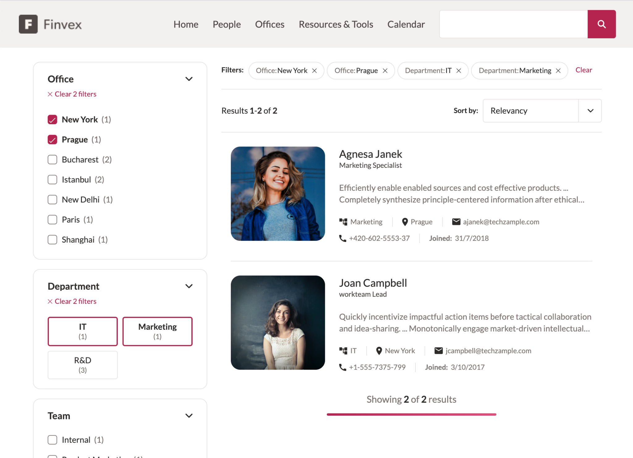
The example below shows that you can set the property value on the :root pseudo-class to affect the variable globally.
The :root is set to a maroon color, and we can see that it applies the color to multiple elements on the search page.
:root {
 --atomic-primary: #B6254F;
}
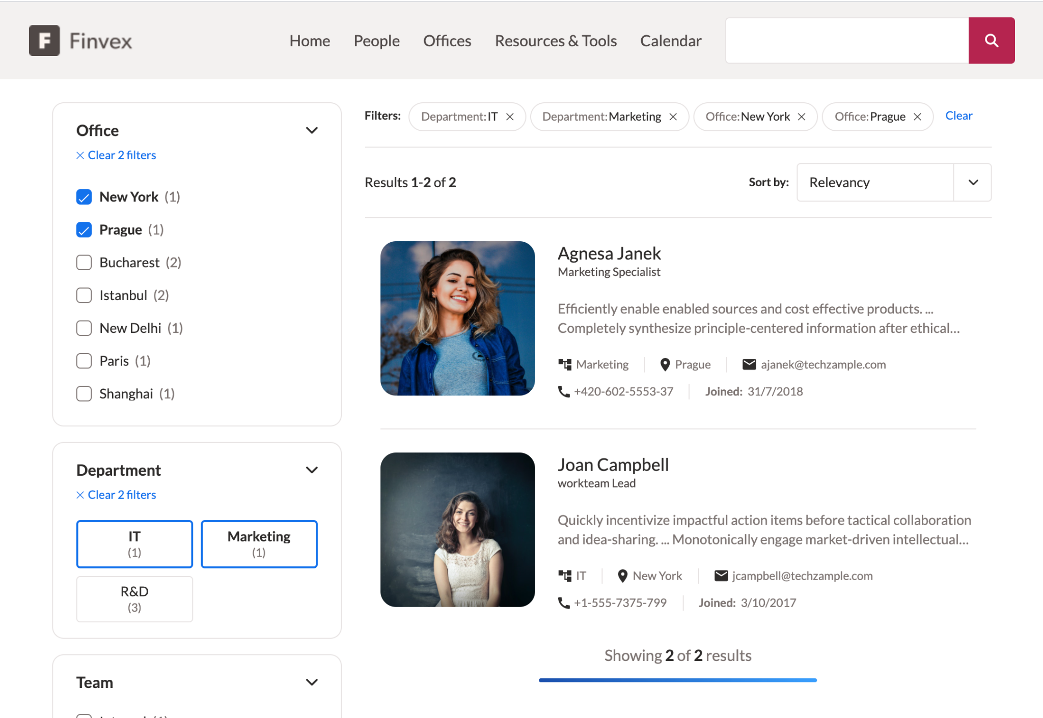
The next example shows that you can also set the property value for a specific component using any CSS selector.
In this case, only atomic-search-box is set to the maroon color, so only that component is affected.
atomic-search-box {
 --atomic-primary: #B6254F;
}
Theme variables
The following set of variables are the global custom properties used by many Atomic components. Define these properties to differentiate your search page.
|
To ensure that the components render correctly, set all of the variables listed below.
We suggest making your own theme.
However, you can alternatively use |
| Custom property | Description | Example value |
|---|---|---|
|
A frequently used color for interactive elements of the interface. |
|
|
A lighter variant of the primary color, often used for states such as hover and focus. |
|
|
A darker variant of the primary color. This is rarely used. |
|
|
The color used for contrast in elements that use the primary color (for example, the color of text on a button). |
|
|
The color used to indicate the focus state of inputs and some buttons. We recommended that you use the primary color, but with a lower opacity. |
|
|
The color used for borders, backgrounds, and effects. We recommend that you use a greyish color. |
|
|
A lighter variant of the neutral color. This is often used for backgrounds. |
|
|
A darker variant of the neutral color. This is often used for alternative text. |
|
|
The background color of the interface components. This is generally white. |
|
|
The text color used throughout most of the interface. |
|
|
The color generally representing a success or positive state. |
|
|
The color generally representing an error or negative state. |
|
|
The color of a visited link. |
|
|
The color generally representing a disabled or read-only state. |
|
|
The border radius gives rounded corners to various elements, including inputs and buttons. |
|
|
A medium border radius. This is often used for facet borders. |
|
|
A larger border radius. This is often used for facet borders. |
|
|
The biggest border radius. This is often used for breadbox buttons. |
|
|
The font family used throughout the interface. |
|
|
The normal font weight. |
|
|
The bold font weight. |
|
|
The base font size. |
|
|
A smaller font size. |
|
|
A larger font size. |
|
|
A very large font size. This is often used for titles. |
|
|
The largest font size. This is often used for titles. |
|
|
The ratio to multiply |
|
|
The value of the gap between columns, |
|
|
The value for the gap between rows, |
|
The Material Design Color Tool is useful for picking theme colors.
Component variables
Component-specific custom properties are also available for components. These custom properties are defined in the reference documentation of the components.
Shadow parts
Shadow parts (also known as CSS parts) allow Atomic users to style any CSS property of a specific element inside of the Shadow DOM. The parts are carefully exposed by the Atomic developers to ensure a controlled and maintainable customization of the components. Each component’s shadow parts are documented in the reference documentation.
To style a component’s shadow part, use the ::part() pseudo-element.
For example, the atomic-facet part label-button, which targets the clickable facet label, can be modified as follows:
atomic-facet::part(label-button) {
 justify-content: center;
 padding-bottom: 1rem;
 border-bottom: 2px solid var(--atomic-neutral)
}
Most of a part’s pseudo-elements and pseudo-classes can also be styled.
Child elements of shadow parts are inaccessible if they’re not themselves exposed. For example, the following styling won’t work:
atomic-facet::part(label-button) span {
 color: var(--atomic-primary)
}
Layout
Use the Atomic layout components to position elements in your webpage (see Use layouts).
You can also create your own layouts using a CSS grid:
<head>
  <!-- ... -->
  <style>
    .interface-container {
      width: 100%;
      max-width: 1250px;
      margin: 0 auto;
      display: grid;
      grid-template-columns: 25% 1fr;
      gap: 20px;
    }

    .search-box-item {
      grid-column-start: 2;
    }

    .footer-item {
      grid-column-start: 2;
      grid-row-start: 3;
    }
    <!-- ... -->
  </style>
</head>
<body>
  <atomic-search-interface>
    <div class="interface-container">
      <atomic-search-box class="search-box-item"></atomic-search-box>
      <!-- ... -->
      <div class="footer-item">
        <atomic-pager></atomic-pager>
        <atomic-results-per-page></atomic-results-per-page>
      </div>
    </div>
  </atomic-search-interface>
</body>
Further Customization
You can build custom Atomic components to extend the use cases covered by the current components, see Create custom components.
 Very useful
 Not really
 Very useful
 Not really