Add a custom dropdown menu to a searchbox
Add a custom dropdown menu to a searchbox
This is for:
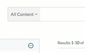
DeveloperYou may want to add a custom dropdown menu next to your search box so that, for example, the end user can enforce a specific query filter by selecting one of its items. This article contains code samples and explanations on how to implement and use a custom component to achieve this goal (see Create custom components).
|
Note
Although the custom component presented in this article doesn’t affect the query, you can add extra code to do so, according to your specific needs. |
-
Create two custom components:
-
A component that acts as a list/container for dropdown menu items:
// SearchboxDropdown.ts import { Component, Initialization, LazyInitialization, ComponentOptions, IComponentBindings, IComponentDefinition, Utils, load, $$ } from 'coveo-search-ui'; import { ISearchboxDropdownItemOptions, SearchboxDropdownItem } from './SearchboxDropdownItem'; export interface ISearchboxDropdownOptions {} export class SearchboxDropdown extends Component { static ID = 'SearchboxDropdown'; static options: ISearchboxDropdownOptions = {}; private selectedItem: SearchboxDropdownItem = null; public itemList: HTMLElement = null; constructor(public element: HTMLElement, public options: ISearchboxDropdownOptions, public bindings?: IComponentBindings) { super(element, SearchboxDropdown.ID, bindings); this.options = ComponentOptions.initComponentOptions(element, SearchboxDropdown, options); //... this.renderComponent(); }; /** * Adds a SearchboxDropdownItem to the dropdown menu. * @param options The options to apply to the new item. */ public addItem(options: ISearchboxDropdownItemOptions) { let newHTMLElement = $$('div', {class: 'SearchboxDropdownItem'}).el; this.element.appendChild(newHTMLElement); let item = new SearchboxDropdownItem(newHTMLElement, options); }; private renderSelectedItem() { let renderedSelectedItem = $$(this.element).findClass( 'coveo-custom-searchbox-dropdown-selected')[0]; if (!Utils.isNullOrUndefined(renderedSelectedItem)) { renderedSelectedItem.remove(); } let selectedItem = $$('span', {class: 'coveo-custom-searchbox-dropdown-selected'}, this.selectedItem.options.caption + '<i class="fa fa-chevron-down"></i>').el; /** * To make the chevron appear, include Font Awesome * (see https://fontawesome.com/how-to-use/on-the-web/setup/getting-started?using=web-fonts-with-css). * Alternatively, you could also include your own image. */ this.element.appendChild(selectedItem); } /** * Selects a SearchboxDropdownItem. * @param item The item to select. */ public selectItem(item: SearchboxDropdownItem) { this.selectedItem = item; this.renderSelectedItem(); } /** * Toggles the SearchboxDropDown menu */ public toggle() { $$(this.element).toggleClass('active'); }; private handleClick() { this.toggle(); }; private renderComponent() { this.itemList = $$('ul', {class: 'coveo-custom-searchbox-dropdown-content'}).el; this.element.appendChild(this.itemList); $$(this.element).addClass('coveo-custom-searchbox-dropdown'); $$(this.element).on('click', () => this.handleClick()); let that = this; document.onclick = function (this, event: MouseEvent) { if (!$$(<HTMLElement>event.toElement).closest( 'coveo-custom-searchbox-dropdown')) { if ($$(that.element).hasClass('active')) { $$(that.element).toggleClass('active', false); } } }; }; }; export function lazySearchboxDropdown() { return load<IComponentDefinition>('Searchbox').then((Searchbox) => { Initialization.registerAutoCreateComponent(SearchboxDropdown); return SearchboxDropdown; }); }; // Register the 'SearchboxDropdown' lazy component using // the previously defined function. LazyInitialization.registerLazyComponent('SearchboxDropdown', lazySearchboxDropdown); -
A component that acts as an individual item which goes inside a
SearchboxDropdowncomponent:// SearchboxDropdownItem.ts import { Component, Initialization, LazyInitialization, ComponentOptions, IComponentBindings, IComponentDefinition, get, load, $$ } from 'coveo-search-ui'; import { SearchboxDropdown } from './SearchboxDropdown'; export interface ISearchboxDropdownItemOptions { caption: string; target?: string; default?: boolean; position?: string; } export class SearchboxDropdownItem extends Component { static ID = 'SearchboxDropdownItem'; /** * The options for the component. * @componentOptions */ static options: ISearchboxDropdownItemOptions = { /** * Specifies the caption to be displayed on the component. */ caption: ComponentOptions.buildStringOption({defaultValue: ''}), /** * Specifies the target of the component. To be used in your * implementation, for example, in the toggle() function below. */ target: ComponentOptions.buildStringOption({defaultValue: ''}), /** * Specifies whether the component is displayed when the search * page first loads. */ default: ComponentOptions.buildBooleanOption({defaultValue: false}), /** * Specifies the position of the component. */ position: ComponentOptions.buildStringOption({defaultValue: ''}) }; private searchboxDropdown: SearchboxDropdown = null; constructor(public element: HTMLElement, public options: ISearchboxDropdownItemOptions, public bindings?: IComponentBindings) { super(element, SearchboxDropdownItem.ID, bindings); this.options = ComponentOptions.initComponentOptions( element, SearchboxDropdownItem, options); //... this.renderComponent(); }; /** * Toggles the selected item. */ public toggle() { this.searchboxDropdown.selectItem(this); // This is most likely where you would include code to // affect the query, probably using this.options.target } private handleClick() { this.toggle(); }; private renderComponent() { this.searchboxDropdown = <SearchboxDropdown>get(this.element.parentElement); let link = $$('a', {}, this.options.caption).el; let item = $$('li', {class: this.options.position}, '', link).el; $$(link).on('click', () => this.handleClick()); if (this.options.default) { this.searchboxDropdown.selectItem(this); } this.searchboxDropdown.itemList.appendChild(item); }; }; export function lazySearchboxDropdownItem() { return load<IComponentDefinition>('SearchboxDropdown').then( (SearchboxDropdown) => { Initialization.registerAutoCreateComponent(SearchboxDropdownItem); return SearchboxDropdownItem; }); }; // Register the 'SearchboxDropdownItem' lazy component using // the previously defined function. LazyInitialization.registerLazyComponent('SearchboxDropdownItem', lazySearchboxDropdownItem);
-
-
Create a custom style sheet to personalize the component:
// CustomDropDown.scss .CoveoSearchboxDropdownItem { display: none; } .coveo-custom-searchbox-dropdown { position: relative; display: inline-block; float: left; z-index: 12; padding: 12px 10px; font-size: 16px; line-height: 24px; background-color: #f3f3f3; color: #777; border-top: 1px solid #bcc3ca; border-left: 1px solid #bcc3ca; border-top-left-radius: 4px; cursor: pointer; &.active, &:hover { background-color: #D6D4D4; } &.active { .coveo-custom-searchbox-dropdown-content { display: block; } } } .coveo-custom-searchbox-dropdown-selected .fa { font-size: 10px; padding-left: 5px; position: relative; top: -2px; } ul.coveo-custom-searchbox-dropdown-content { display: none; position: absolute; background-color: #f9f9f9; min-width: 160px; box-shadow: 0px 8px 16px 0px rgba(0, 0, 0, 0.2); padding: 0; z-index: 12; margin: 0; list-style-type: none; box-shadow: 0 0px 6px rgba(0, 0, 0, .175); background-color: #e7e7e7; border: 3px solid #fff; border-radius: 0px; font-family: arial; min-width: 250px; left: 0px; top: 55px; li { &.indent a { padding-left: 25px; font-style: italic; } &.hidden { display: none; } a { padding: 3px 10px; border-left: 5px solid transparent; display: block; color: #000; text-decoration: none; &:hover { background-color: #F5F5F5; } } &:hover::before { content: ''; position: absolute; height: 30px; border-left: 5px solid #ca0000; } } } -
Add the custom component to your searchbox:
NoteIn order for the chevron icon to appear in the component, you must include Font Awesome in your search interface (see Getting Started on the Web).
<!-- ... --> <link rel="stylesheet" href="https://use.fontawesome.com/releases/v5.2.0/css/all.css" integrity="sha384-hWVjflwFxL6sNzntih27bfxkr27PmbbK/iSvJ+a4+0owXq79v+lsFkW54bOGbiDQ" crossorigin="anonymous"> <!-- ... --> <div class='coveo-search-section'> <!-- ... --> <div class="CoveoSearchboxDropdown"> <div class="CoveoSearchboxDropdownItem" data-target="" data-caption="All Content" data-default="true"></div> <div class="CoveoSearchboxDropdownItem" data-target="" data-caption="Message"></div> <div class="CoveoSearchboxDropdownItem" data-target="" data-caption="Thread"></div> </div> <!-- ... --> </div> -
Dynamically add entries to your component by inserting code such as the following in your script:
// Some Script
// ...
if (someCondition){
  Coveo.get(document.getElementsByClassName('CoveoSearchboxDropdown')[0]).addItem({caption:'Video',default:true});
}
// ...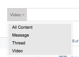
 Very useful
 Not really
 Very useful
 Not really