Displaying results as a list or grid
Displaying results as a list or grid
Using the atomic-result-list component, results can be displayed as a list or grid.
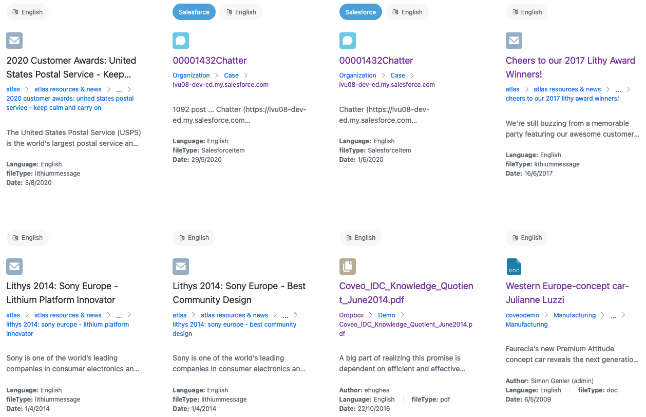
Choose a layout
The layout defines whether results are going to be displayed as a list or a grid.
You can choose a layout by setting the display attribute on the atomic-result-list component.
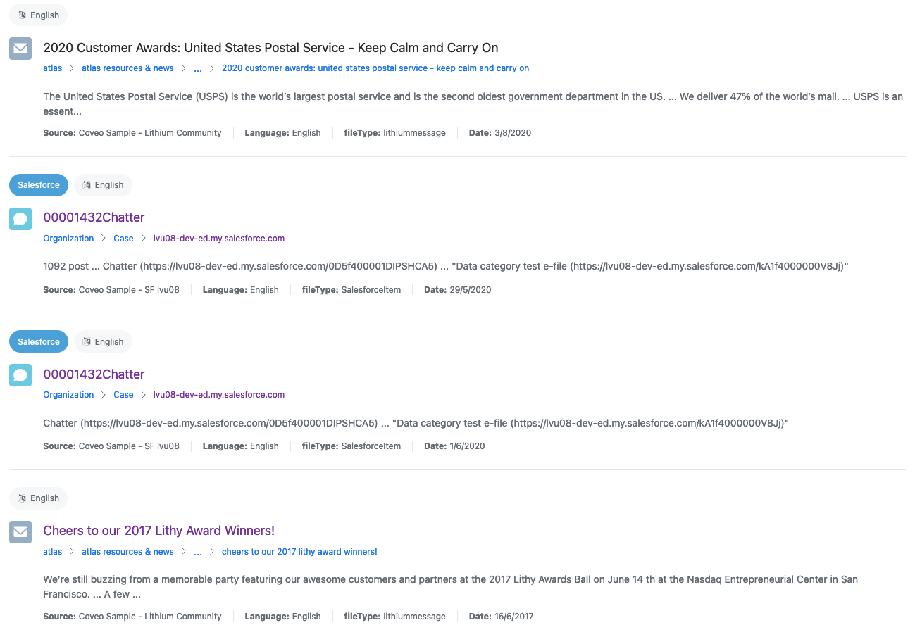
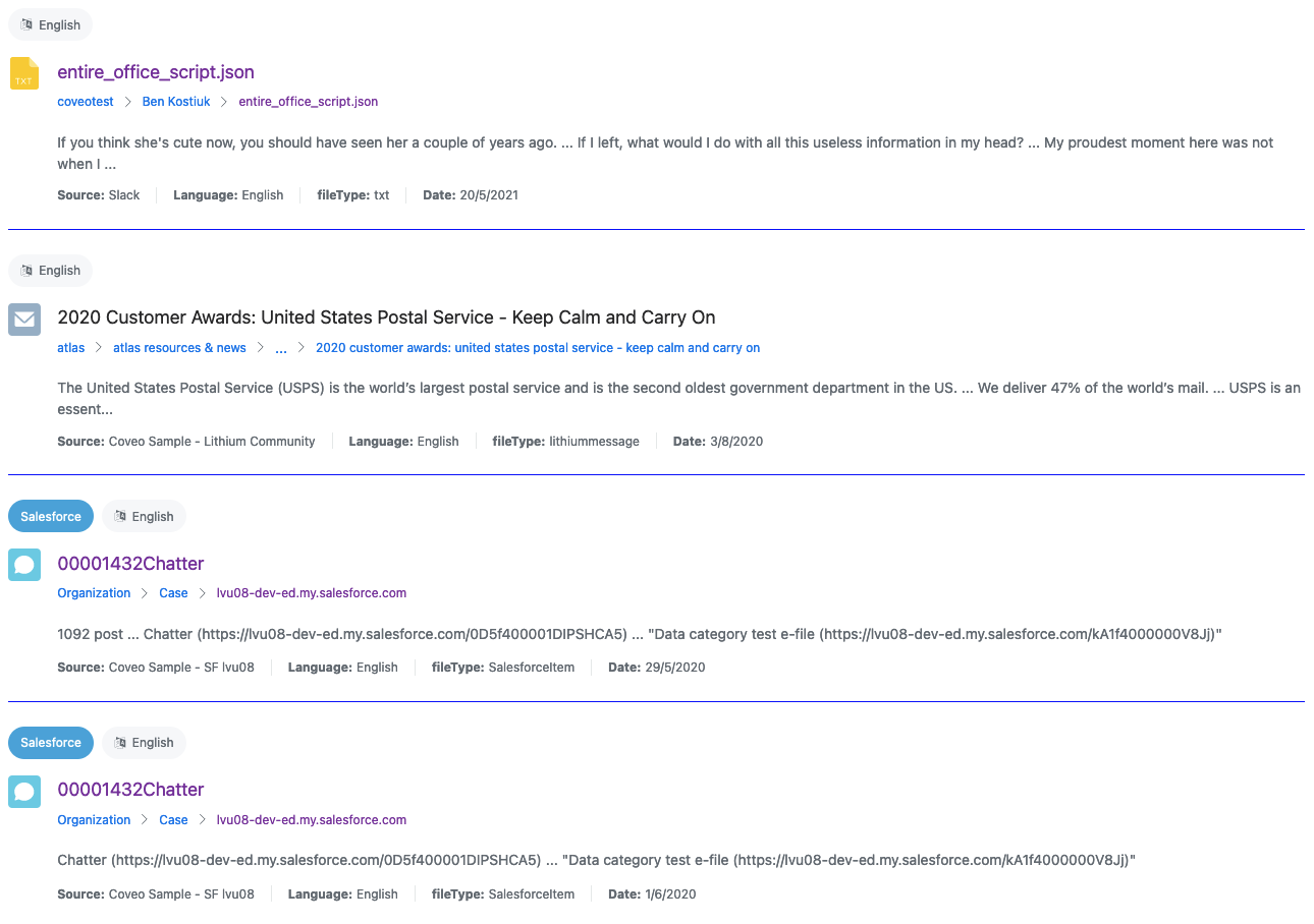
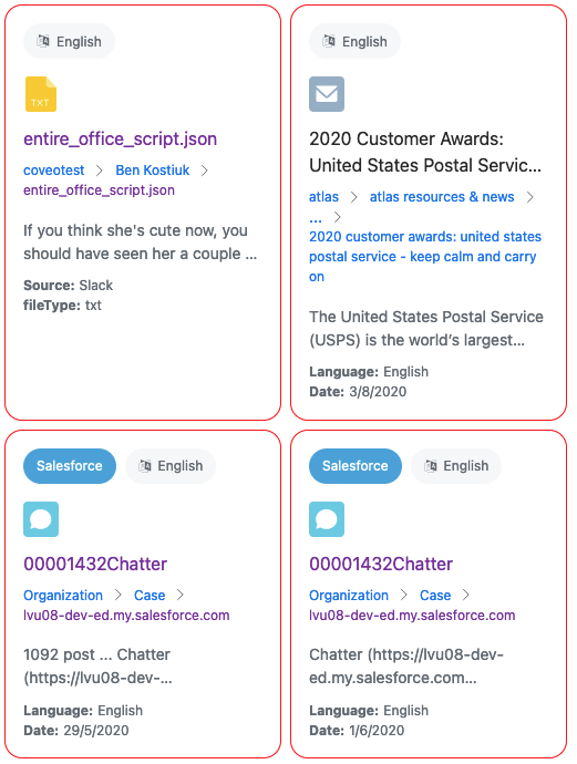
List
List is the default layout. The list layout displays a single column containing all the results, taking the full available width. On a desktop browser, a divider separates the list results. On mobile, they’re generally displayed as cards surrounded by outlines.
<atomic-result-list
  display="list"
>
  ...
</atomic-result-list>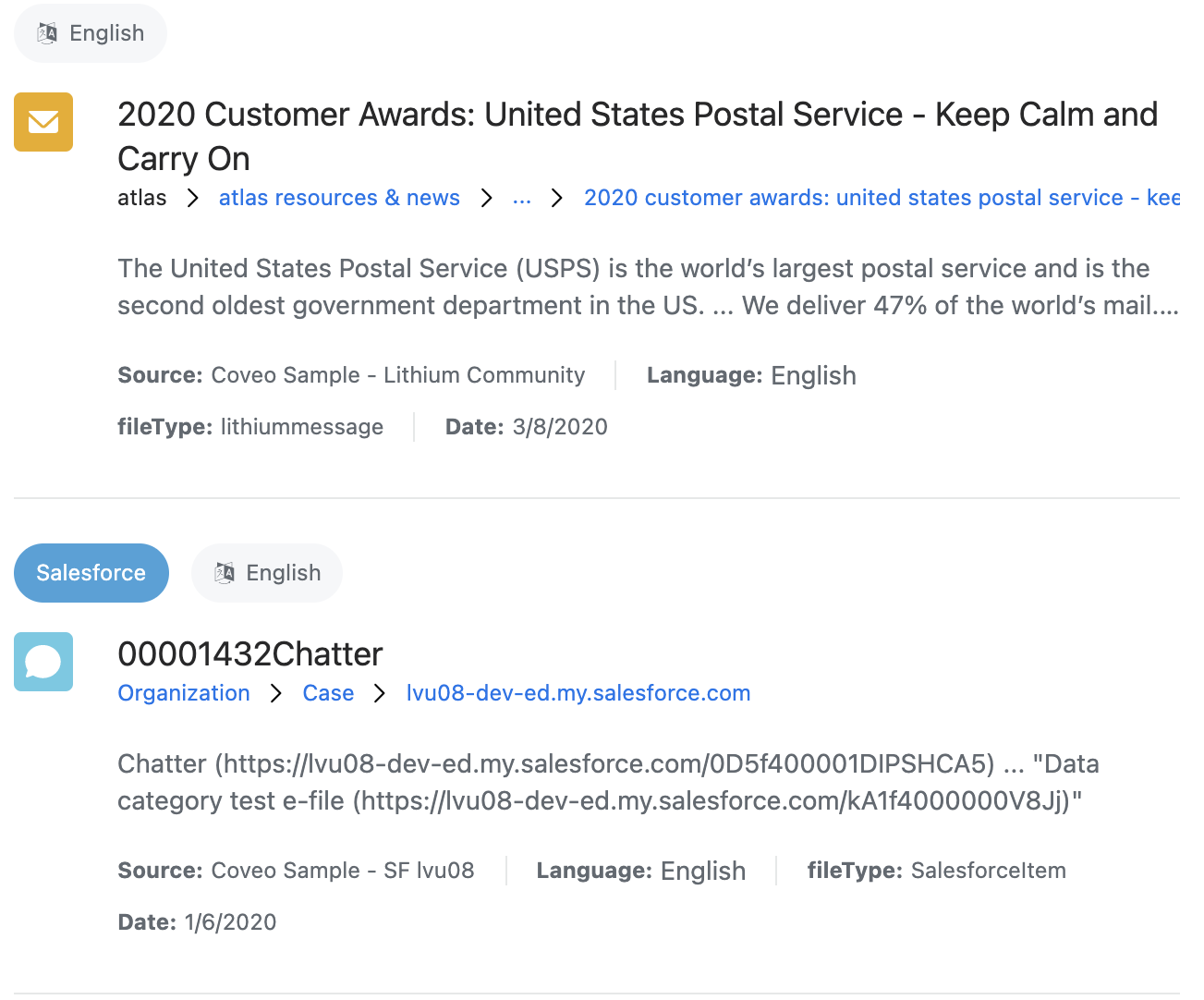
Optional: Choosing a density
The density attribute defines the spacing of various elements in the result list, including the gap between results.
When the result sections are used, the gap between parts of a result and the font sizes of different parts of a result are also adjusted.
The possible values of density are:
-
comfortable -
normal(default) -
compact
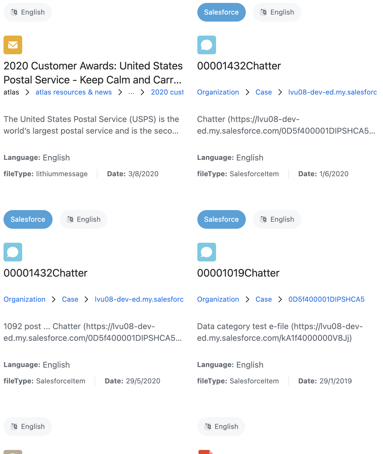
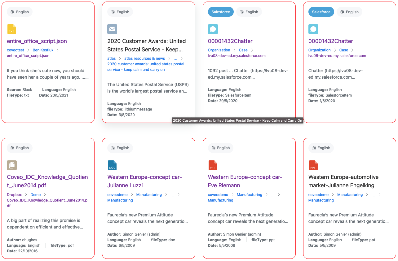
Optional: Choosing an image size
The image-size attribute defines the expected size of images in the list, and has four possible values:
-
none -
icon(default) -
small -
large
This affects how many results should be displayed horizontally.
On mobile, this also affects whether results should have an outline or dividers:
-
When this is set to
none,icon, orsmall, the results on mobile have an outline. -
When this is set to
large, the results on mobile are separated by dividers.
When the result sections are used, they also change the size of the atomic-result-section-visual section.
 Very useful
 Not really