Leverage the Coveo Atomic library
Leverage the Coveo Atomic library
The Atomic library offers a large collection of components to help you create, customize, and maintain end-user interfaces that rely on the Coveo Platform. You can leverage Atomic to build and send queries, display query results, and log appropriate Coveo Analytics events.
|
|
We recommend the Atomic library for most use cases, but in some circumstances you might decide to use the Headless library or even use the Coveo APIs directly. If you do use the Coveo APIs, make sure that you log the right UA events. If you don’t, you won’t be able to use Coveo Machine Learning (Coveo ML) or Coveo Analytics reporting. |
This article provides a high-level overview of the crucial steps and elements required to design your search interface using the Atomic library.
Install Atomic
You can install the Atomic library as an npm package or load it through CDN links in the page <head>.
The simplest option is to include the CDN links, as follows:
<script
    type="module"
    src="https://static.cloud.coveo.com/atomic/v2/atomic.esm.js">
</script>
<link
    rel="stylesheet"
    href="https://static.cloud.coveo.com/atomic/v2/themes/coveo.css"/>
| The main Atomic script. | |
| The default Atomic stylesheet. While this import is optional, if you don’t import it you’ll need to define its variables yourself. |
Initialize the search interface
Once you have installed Atomic, you’ll need to add a script like the following to initialize it:
<head>
<!-- ... -->
<script>
(async () => {
await customElements.whenDefined('atomic-search-interface');
const searchInterface = document.querySelector('#search');
await searchInterface.initialize({
accessToken: '<ACCESS_TOKEN>',  organizationId: '<ORGANIZATION_ID>',
  renewAccessToken: <CALLBACK>,
  });
searchInterface.executeFirstSearch();
})();
</script>
<!-- ... -->
</head>
<ACCESS_TOKEN> (string) is an API key that was created using the Anonymous search template or a search token that grants the Allowed access level on the Execute Queries domain and the Push access level on the Analytics Data domain in the target organization.
|
|||
<ORGANIZATION_ID> (string) is the unique identifier of your Coveo organization (for example, mycoveoorganizationa1b23c). |
|||
<CALLBACK> (function) returns a new access token, usually by fetching it from a backend service that can generate search tokens.
The engine will automatically run this function when the current access token expires (that is, when the engine detects a 419 Authentication Timeout HTTP code).
|
Log usage analytics data
Coveo ML features, such as Automatic Relevance Tuning (ART) and Query Suggestions (QS), require Coveo Analytics data to function. When used correctly, Atomic components provide this data by logging search and click events for you. You can also customize event logging to meet your needs.
However, to power a content recommendations model, you must send view events for the target items.
Use components to create your search interface
Atomic builds search pages by attaching components to target HTML elements. You can create your own search interface by assembling the desired components, as shown in the following example:
<body>
<atomic-search-interface id="search">  <atomic-search-layout>
<atomic-layout-section section="search">
  <atomic-search-box></atomic-search-box>
  </atomic-layout-section>
<atomic-layout-section section="facets">
  <atomic-facet-manager>
<atomic-facet field="author" label="Authors"></atomic-facet>
  <!-- ... -->
</atomic-facet-manager>
</atomic-layout-section>
<atomic-layout-section section="main">
  <!-- ... -->
<atomic-layout-section section="results">
<atomic-result-list></atomic-result-list>
  </atomic-layout-section>
<atomic-layout-section section="pagination">
<atomic-load-more-results></atomic-load-more-results>
  </atomic-layout-section>
</atomic-search-layout>
</atomic-search-interface>
</body>
</atomic-layout-section>
</atomic-layout-section>
</atomic-search-layout>
</atomic-search-interface>
</body>The following screenshot illustrates how Atomic components fit together in a search interface:
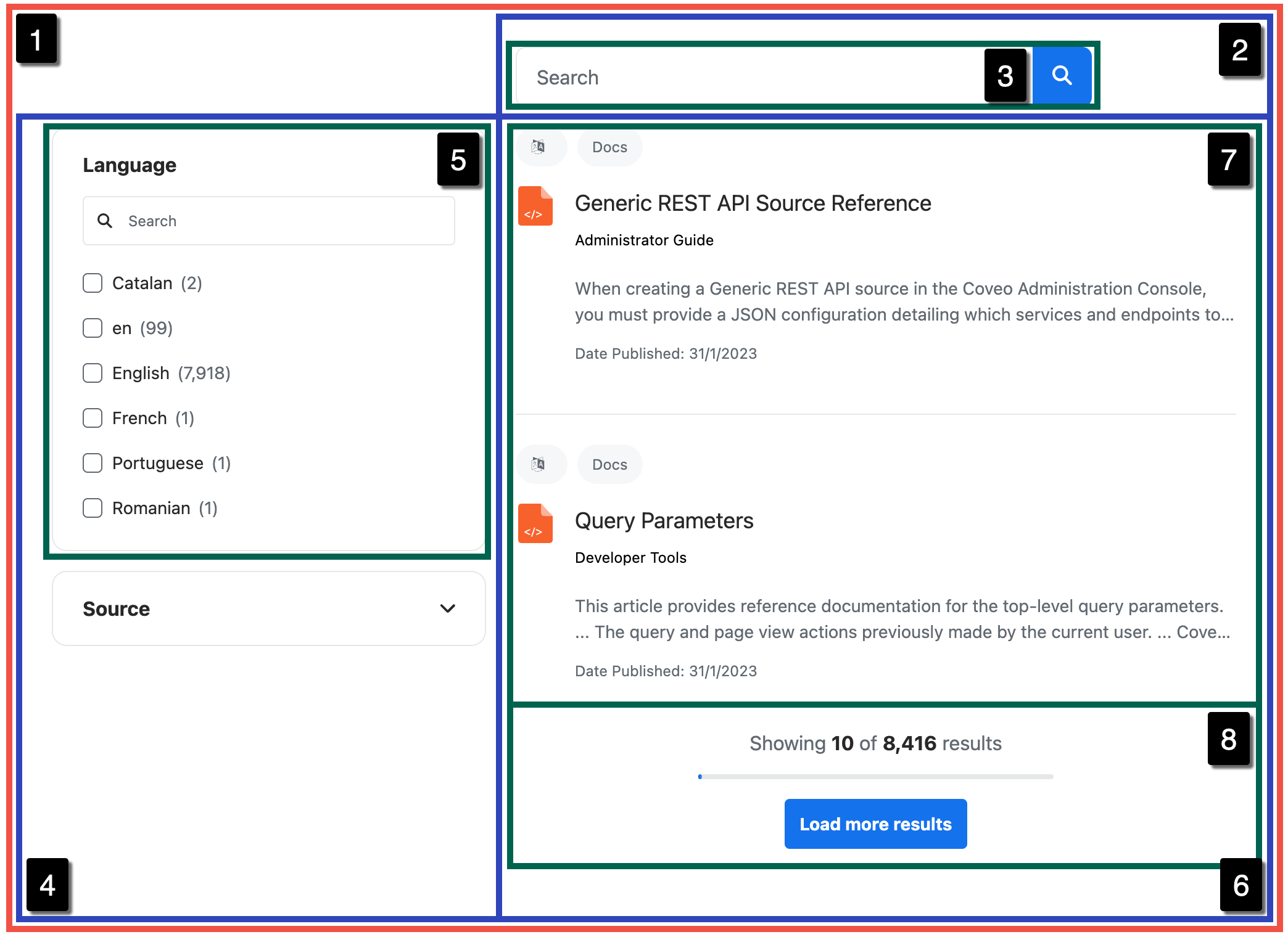
The rest of this article provides a very general overview of a few key Atomic components. For more detailed information on how to use components, you can visit the Atomic usage documentation.
Organize your components
The atomic-search-layout and atomic-layout-section components help you keep your Atomic components organized.
You can nest <atomic-layout-section> elements.
<atomic-search-interface id="search">
  <atomic-search-layout>
    <atomic-layout-section section="search">
      <!-- ... -->
    </atomic-layout-section>
    <atomic-layout-section section="facets">
      <!-- ... -->
    </atomic-layout-section>
    <atomic-layout-section section="main">
      <atomic-layout-section section="status">
        <!-- ... -->
      </atomic-layout-section>
      <atomic-layout-section section="results">
        <!-- ... -->
      </atomic-layout-section>
      <!-- ... -->
    </atomic-layout-section>
    <!-- ... -->
  </atomic-search-layout>
</atomic-search-interface>
All of the examples in this section will be enclosed in <atomic-layout-section> elements.
Create a search box
A search box is a text input field from which queries can be submitted, and it’s the centerpiece of most search interfaces.
The atomic-search-box component comes with built-in support for QS.
<atomic-layout-section section="search">
  <atomic-search-box></atomic-search-box>
</atomic-layout-section>
This component adds a basic search box:

|
|
Note
You can also use Atomic to implement a standalone search box. |
Create a result list
The atomic-result-list component displays query results using one or more result templates.
<atomic-layout-section section="results">
  <atomic-result-list></atomic-result-list>
</atomic-layout-section>
This component adds a basic result list:
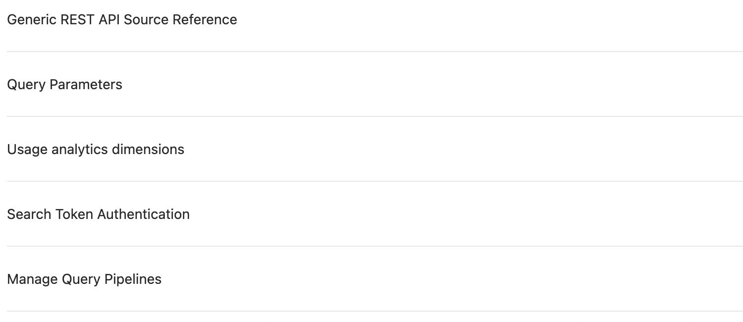
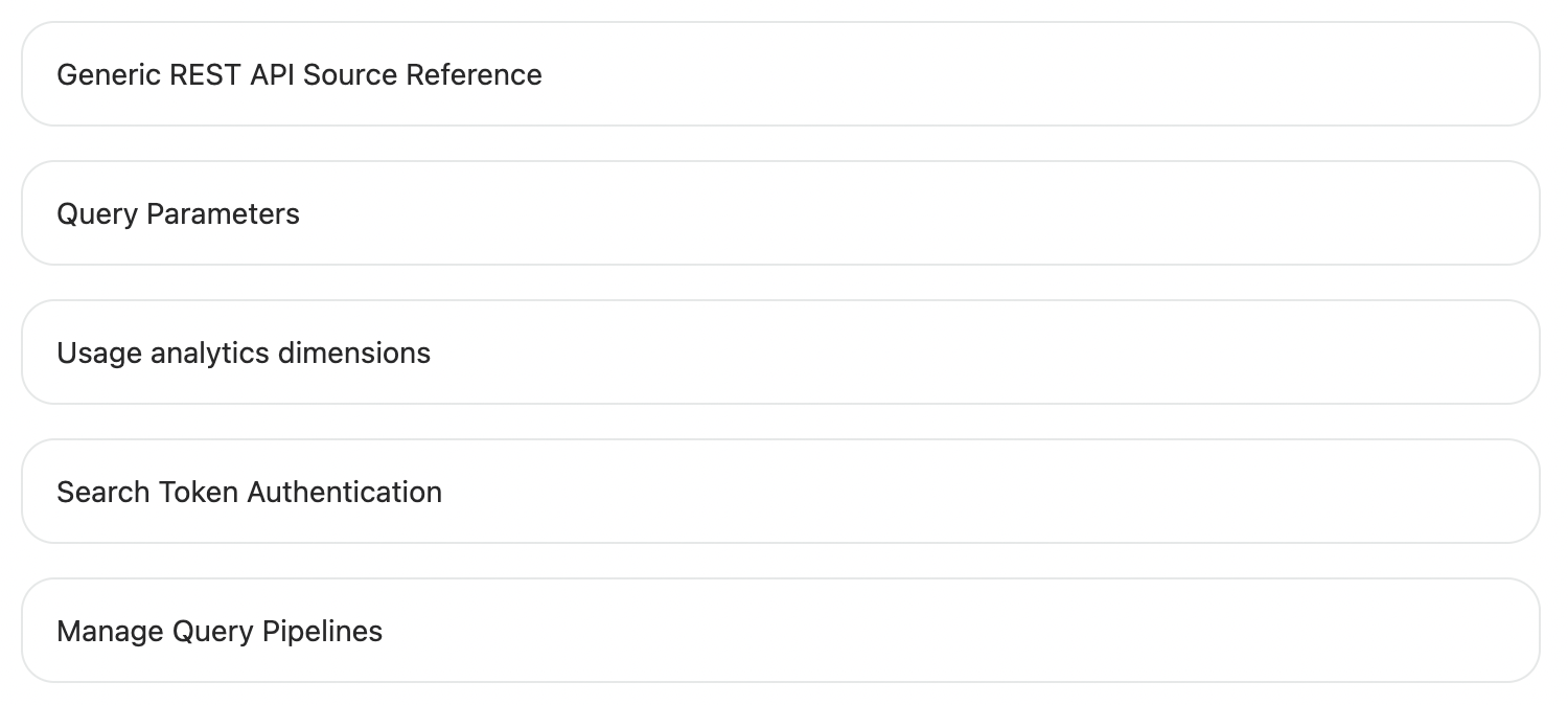
Atomic result lists are responsive. On windows that are under 1024px in width, the results are displayed as tiles:
Customize the result list
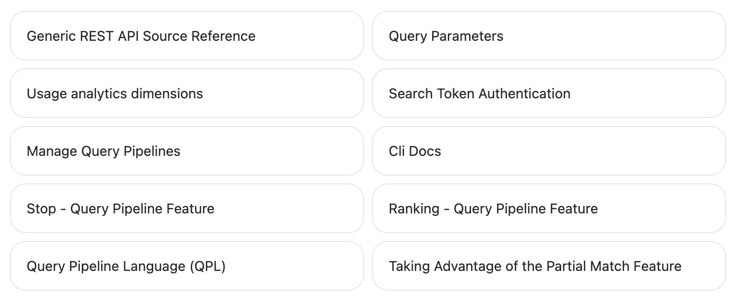
In the atomic-result-list component, you can set the display format, density, and image size of the result items.
<atomic-result-list display="grid"></atomic-result-list>This presents the search results in a grid:
Add sorting
The atomic-sort-dropdown component adds a dropdown menu that lets the user reorder the result items according to a particular criterion.
<atomic-layout-section section="status">
  <!-- ... -->
  <atomic-sort-dropdown>
    <atomic-sort-expression label="relevance" expression="relevancy"></atomic-sort-expression>
    <atomic-sort-expression label="most-recent" expression="date descending"></atomic-sort-expression>
  </atomic-sort-dropdown>
  <!-- ... -->
</atomic-layout-section>
This component adds the following interface:

Add pagination
Atomic includes two pagination components, atomic-pager and atomic-load-more-results.
The former lets the user navigate through different result pages, while the latter loads additional results if more are available.
You can combine atomic-pager with the atomic-results-per-page component to let users control how many results they can see at a time.
Pager
<atomic-layout-section section="pagination">
  <atomic-pager></atomic-pager>
  <atomic-results-per-page></atomic-results-per-page>
</atomic-layout-section>
This component adds the following interface:
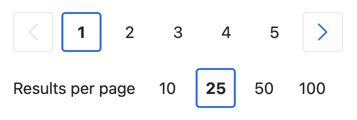
Load more results
<atomic-layout-section section="pagination">
  <atomic-load-more-results></atomic-load-more-results>
</atomic-layout-section>
This component adds the following interface:
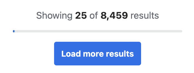
Create facets
A search page typically includes facets.
These allow the end user to select dynamic filter values which narrow down a query to a specific subset of result items.
In addition to the basic atomic-facet component, Atomic has several specialized facets including category, rating, and timeframe facets.
Atomic facets are responsive. The facet column isn’t visible on windows that are under 1024px in width.
In Atomic, these facets are usually enclosed in the atomic-facet-manager component, which leverages Coveo ML to reorder them based on their relevance in the current context.
<atomic-layout-section section="facets">
  <!-- ... -->
  <atomic-facet-manager>
    <atomic-facet field="source" label="Source"></atomic-facet>
    <atomic-facet field="language" label="Language"></atomic-facet>
    <!-- ... -->
  </atomic-facet-manager>
  <!-- ... -->
</atomic-layout-section>
<atomic-facet field="language" label="Language"></atomic-facet>
<!-- ... -->
</atomic-facet-manager>
<!-- ... -->
</atomic-layout-section>The field property is required.
The label property isn’t, but you probably want to replace the default, which is No label. |
This adds the following facets:
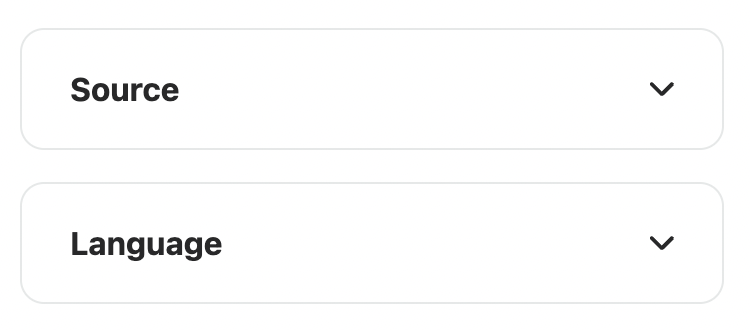
Add a refine search button
On smaller screens, the facet column would take up too much horizontal space.
You can add the atomic-refine-toggle component to let the user open the facets in a modal.
This component is responsive, so it’s only visible on windows that are under 1024px in width.
<atomic-layout-section section="status">
  <!-- ... -->
  <atomic-refine-toggle></atomic-refine-toggle>
  <!-- ... -->
</atomic-layout-section>
This adds the following interface:

When opened, the Sort & Filter modal looks like this:
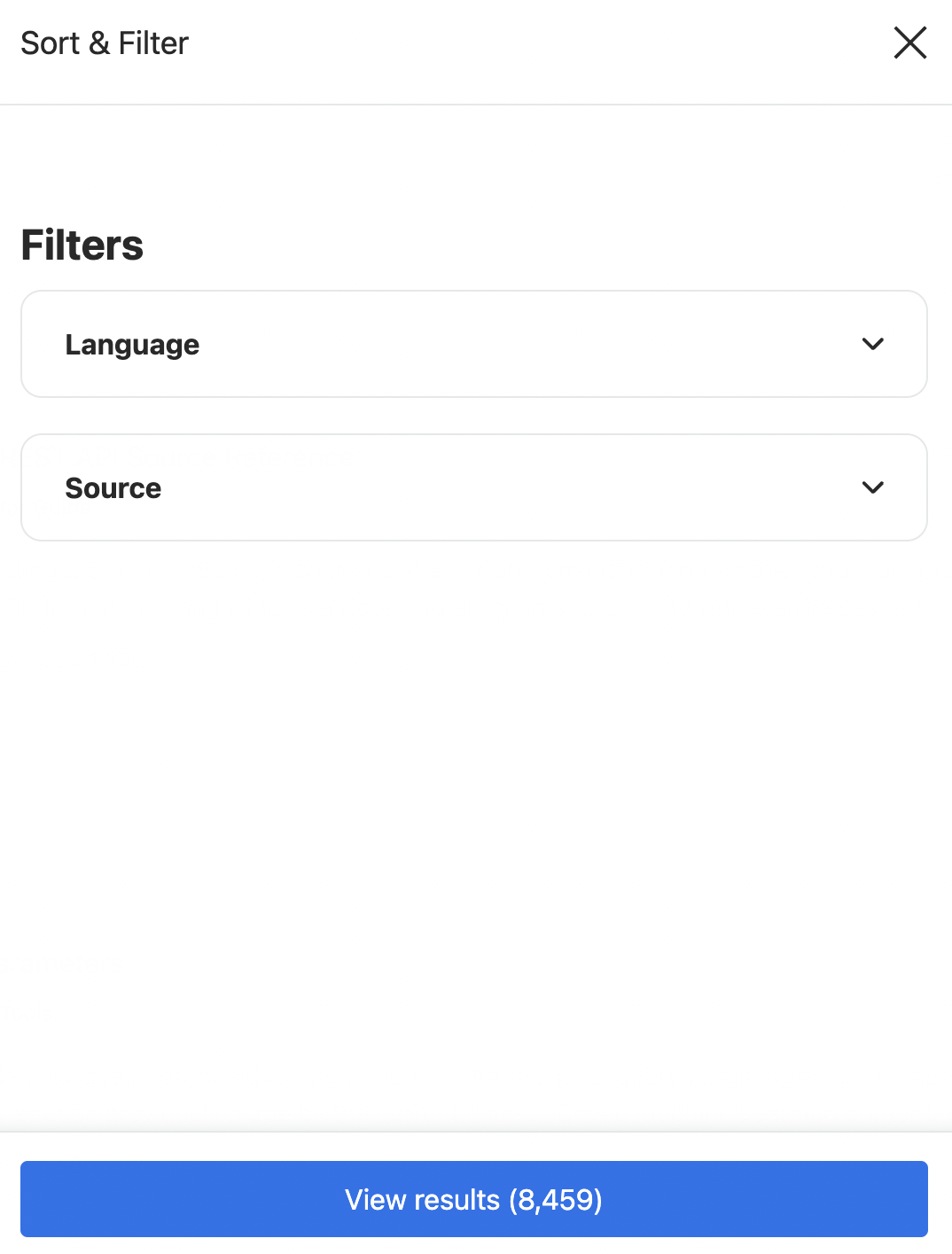
Create a result template
Result templates determine the format of the individual query results in the result list.
You can define multiple atomic-result-template components, each of which applies when different conditions are met.
A result template without any conditions is considered the default template.
If a result fails to satisfy the conditions of any other template, it is rendered using the default template.
When a result list is in a list or grid display format, you can use result sections to construct your result template.
Result templates are made up of various components, including atomic-result-link, atomic-result-text, and atomic-result-icon.
These components are typically used in specific result sections.
<atomic-layout-section section="results">
  <atomic-result-list display="grid">
    <atomic-result-template>
      <template>
        <!-- ... -->
        <atomic-result-section-title>
          <atomic-result-link></atomic-result-link>
        </atomic-result-section-title>
        <!-- ... -->
        <atomic-result-section-excerpt>
          <atomic-result-text field="excerpt"></atomic-result-text>
        </atomic-result-section-excerpt>
        <!-- ... -->
      </template>
    </atomic-result-template>
    <!-- ... -->
  </atomic-result-list>
</atomic-layout-section>
This result template would appear as follows:
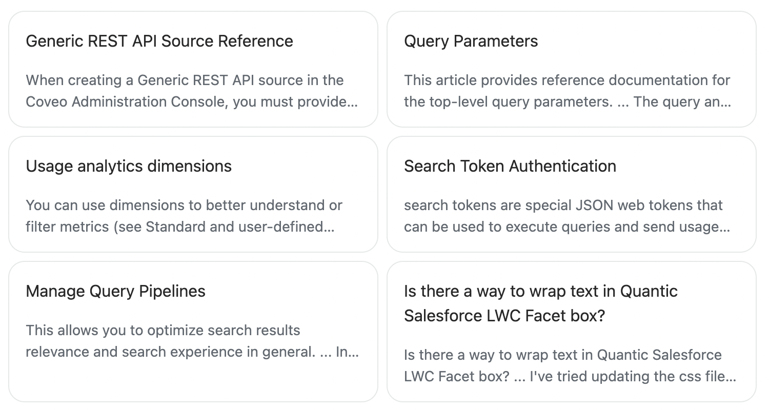
Result template example
The following is a more comprehensive example of a result template. It includes an icon, badges, and two separate metadata sections.
To add styling that’s specific to your result template, you add the CSS to a <style> element directly within the <template>.
Atomic makes use of shadow DOM, so you can either target components or any of the shadow parts that have been exposed for them.
You can also target specific parts using the element id.
<atomic-result-template>
<template>
<style>
atomic-result-section-badges {
display: flex;
}
#docs-badge::part(result-badge-element) {
background-color: #333357;
color: #fff;
}
</style>
<atomic-result-section-visual>
<atomic-result-icon></atomic-result-icon>
</atomic-result-section-visual>
<atomic-result-section-badges>
<atomic-result-badge
id="language-badge"
field="language"
icon="https://raw.githubusercontent.com/Rush/Font-Awesome-SVG-PNG/master/black/svg/language.svg"
></atomic-result-badge>
<atomic-field-condition must-match-source="docs.coveo.com">
<atomic-result-badge
id="docs-badge"
label="Docs"
></atomic-result-badge>
</atomic-field-condition>
</atomic-result-section-badges>
<atomic-result-section-title>
<atomic-result-link></atomic-result-link>
</atomic-result-section-title>
<atomic-result-section-title-metadata>
<atomic-field-condition if-defined="objecttype">
<atomic-result-text field="objecttype"></atomic-result-text>
</atomic-field-condition>
</atomic-result-section-title-metadata>
<atomic-result-section-excerpt>
<atomic-result-text field="excerpt"></atomic-result-text>
</atomic-result-section-excerpt>
<atomic-result-section-bottom-metadata>
<atomic-result-fields-list>
<atomic-field-condition if-defined="date">
<span class="field-label">Date Published:</span>
<atomic-result-date></atomic-result-date>
</atomic-field-condition>
</atomic-result-fields-list>
</atomic-result-section-bottom-metadata>
</template>
</atomic-result-template>This result template would appear as follows:
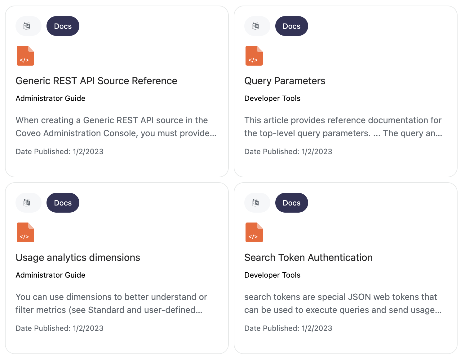
What’s next?
The Design an architecture for multiple search experiences article presents the leading practices when designing multiple Coveo-powered search experiences.