Coveo Hive search page structure
Coveo Hive search page structure
|
Legacy feature
The Coveo Hive Framework is now in maintenance mode and is no longer recommended for new implementations. To build new search experiences, use one of Coveo’s more modern, lightweight, and responsive libraries. To get started, see the Build search article. |
The Coveo Hive Framework contains a large amount of placeholder settings, providing a basic hierarchy to the Hive components. Most components, especially section-type components, give access to more specific placeholders, allowing you to add sub-components. This way, you can easily build a search page from scratch without getting overwhelmed by the large amount of out-of-the box components.
The following guide covers the main placeholders that define the default hierarchy. However, you can at all time add a Coveo Hive component to your own placeholders, or extend the Coveo Hive placeholders.
Keep in mind that extending a Coveo Hive placeholder directly isn’t recommended, as it can break future upgrades. Hence we recommend to use the Placeholder Extender (see Insert custom components in an existing search interface - Patching the allowed controls of an existing placeholder).
About sections
Sections are renderings that will insert new placeholders on the page. They usually have no other function than to define the hierarchy of the Coveo Hive components.
|
Most section-type components have been removed in the Coveo for Sitecore Experience Accelerator (SXA) library of components, the reason being that SXA provides numerous containers of its own, allowing you to manage your specific hierarchy of components. |
The base placeholders
The two placeholder settings at the top of the Coveo Hive hierarchy are the Coveo UI and UI Resources placeholders.
Coveo UI
This placeholder lets you add a variety of components. While the majority of these components are visual components which the end user interacts with (and that appear in the red section placeholders in the diagram below), there are also some components that are invisible to the end user but still influence the page behavior.
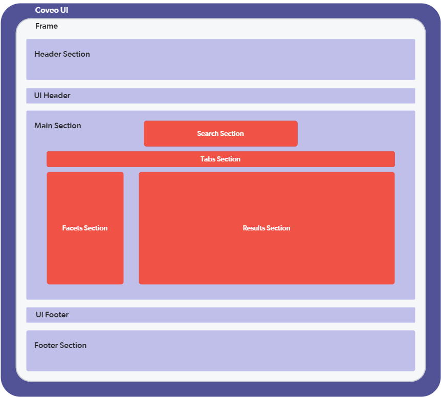
UI Resources
This placeholder holds the common scripts that are required to make all the other components work together.
Adding resources and Search Interface
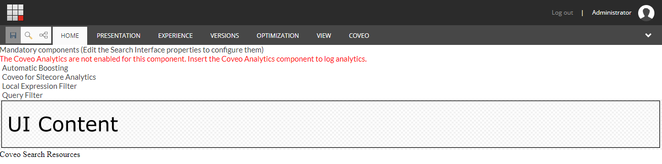
The Coveo Search Interface component includes:
-
A set of common components that are used in almost any search interface. The options for these components are modified through the Coveo Search Interface component data source.
-
The UI Content placeholder.
UI Content
This placeholder allows you to add frame components that better define how the visual components are organized in the page. The available frames are:
-
Default Frame
-
Modular Frame
-
Modular Frame: 3 columns
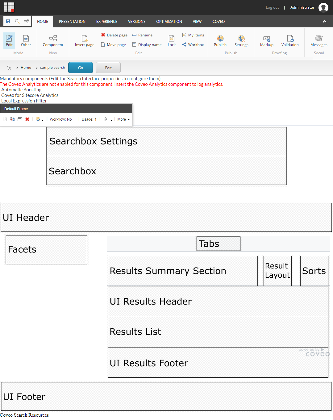
The Default Frame component doesn’t contain any sections, which makes it the easier to understand but the less flexible.
Example of a page structure with the Default Frame
Since the Default Frame component is the one with the most constant hierarchy, we’ll use it as an example.
When you add the Default Frame, you get a page with the following placeholders:
-
Searchbox Settings
-
Searchbox
-
Searchbox Options
-
UI Header
-
Facets
-
Tabs
-
Results Summary Section
-
Result Layout
-
Sorts
-
UI Results Header
-
Results List
-
UI Results Footer
-
UI Footer
These placeholders are meant to house the following components:
Searchbox Settings
This placeholder allows you to add the Searchbox Settings component. This is the ellipsis button that appears next to the searchbox, activating some additional searchbox features. Those features depend on the components added to the Searchbox Options placeholder.
|
|
The Searchbox Options placeholder only appears when a Searchbox Settings component is added to the Searchbox Settings placeholder. |
Searchbox Options
This placeholder allows you to add optional search box features such as:
-
Advanced Search
-
Preferences Panel
-
Share Query
-
Export to Excel
Searchbox
This placeholder is used to insert the Searchbox component.
UI Header
This placeholder allows you to add a variety of components that aren’t visible to the users such as additional resources, query filters, or external content. It also allows visual components like pagers, query statistics, and others to be placed.
Facets
This placeholder allows you to add a variety of facet components such as slider and range facets. A distance facet is also available. The facets allow the end user to easily refine the search results with their own criteria.
Tabs
This placeholder allows you to add the Tab component. The tab is useful when you want to present different groups of content in a single search page. For example, you could have a tab that shows people results and another showing products.
Results Summary Section
This placeholder allows you to display information on the current query. It allows you to add the following components:
-
Query Summary
-
Query Duration
Result Layout
This placeholder allows you to add components allowing the user to select which layout to use to display the search results. For example, the user could view the search results either as a list or as cards. It allows you to add the Result Layout component.
Sorts
This placeholder allows to add various sort components to sort results by:
-
Relevancy
-
Date
-
Field
-
Distance
UI Results Header
This placeholder allows you to add various components displaying information about the current query and results such as:
-
Breadcrumb
-
Did you mean
-
Query execution time
-
Number of results
Results List
This placeholder allows you to add result lists to the page. Usually, a search page will have only one result list. However, you might want different representations of the same results, for example to be able to view results as list or as cards. In this case, you will include many result lists component and assign a specific result templates to each one.
Adding a result list also brings the Result Templates placeholder. It then allows you to add various result templates to link them to the current result list component.
UI Results Footer
This placeholder allows you to add various components. Most of the time, it’s used to put the Pager and Results Per Page components.
UI Footer
This placeholder allows you to add a variety of components. In the available frames, this placeholder adjusts to the width of the search interface.
 Very useful
 Not really
 Very useful
 Not really