Design your form
Design your form
A good practice is to sketch your form before you start building it. You can use digital tools such as Miro and Figma, or a simple sheet of paper. To help you design a great case creation experience, our UX team has written the following blog articles:
This complimentary article lists some additional points to consider when designing a form.
What are the best form elements to use?
Depending on your use case, it’s important to identify the form elements that will let you collect information quickly and accurately.
-
Review the list you created in Step 1: Define the content of your form.
-
Determine how you would like to display the information (for example, text inputs, dropdown menus, selection pills, or checkboxes).
-
Define your input limitations, for example:
Input Limitations Text input
-
What’s the character limit?
-
Is the width of the input adjusted as a hint of the expected input?
Dropdown menu
-
What are the selection options?
-
Will the selection options be listed in alphabetical order or will the most probable choice be listed first?
-
How many selection options will be displayed?
-
Will users be able to select multiple options or just one?
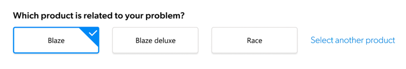
Selection pills
-
How many pills will you allow users to select?
Selecting only one pill at a time is recommended.
-
In what order should information be displayed?
The order in which questions are asked is important. Consider the following recommendations:
-
Group information in logical order. Let users describe their issue first and complete the remaining information afterward, assisted by Coveo Case Classification.
-
Since the Title and Description inputs are related, they should be close to each other.
-
There should typically be five inputs per page. Consider splitting your form into steps if you have more than that.
How will you ask for information?
Word choice is very important. It could make or break your form. For each label, button, title, or description, carefully review the text that will be displayed.
Recommendations
-
Show you understand the user’s struggle by using empathy in your form (for example, try using the user’s name to bring a personal touch).

-
Avoid jargon. Words like "case" or "ticket" aren’t common for users outside the service industry. Determine if the words "request" or "question" are more appropriate for your target audience.
-
A few extra words can help comprehension. Instead of using a single word (for example, "Product:"), try asking a question instead (for example, "What’s your product?").
-
Explain why the information is needed. Users are more likely to provide information if they know why it’s required.
Where should Document Suggestions be displayed?
To find out what works best for your users, test the following options:
-
Display Document Suggestions on its own separate page:
The advantage of displaying suggestions on a separate page is that users only have one task to complete on that page (that is, review the content suggestions without any distractions).

-
Display Document Suggestions next to the form:
The advantage of displaying suggestions next to the form is that users can see the document updates based on input. However, this structure makes document suggestions easier to ignore by the user.

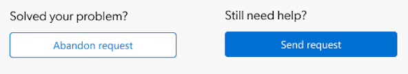
If you decide to offer related help content (for example, "See Also" topics), make sure users can skip this step and complete their case submission process if they want to. It’s important not to block users from moving past this step.
What’s the best way to gather feedback?
Test your form! The best way to gather feedback is to create a prototype that you can show to real users. Otherwise, sketch your form and show it to other members of your team who aren’t involved in the project. Once you’re satisfied with the results, start building!