Create a Result List
Create a Result List
Coveo Atomic lets you choose how to display search results by specifying a layout, a density, and an image size. Atomic also lets you define templates for multiple types of search results to personalize how they look.
Step 1: Choose a layout
A layout defines how you organize the results of a query.
Layouts affect how many results to display per row and how visually distinct they are from each other.
You can choose a layout by setting the display attribute on the atomic-result-list component.
The three available layouts types are: list, grid, and table.
List
List is the default layout. The list layout displays a single column containing all the results, taking the full available width. On a desktop browser, a divider separates the list results. On mobile, they’re displayed as cards surrounded by outlines.
<atomic-result-list
  display="list"
>
  ...
</atomic-result-list>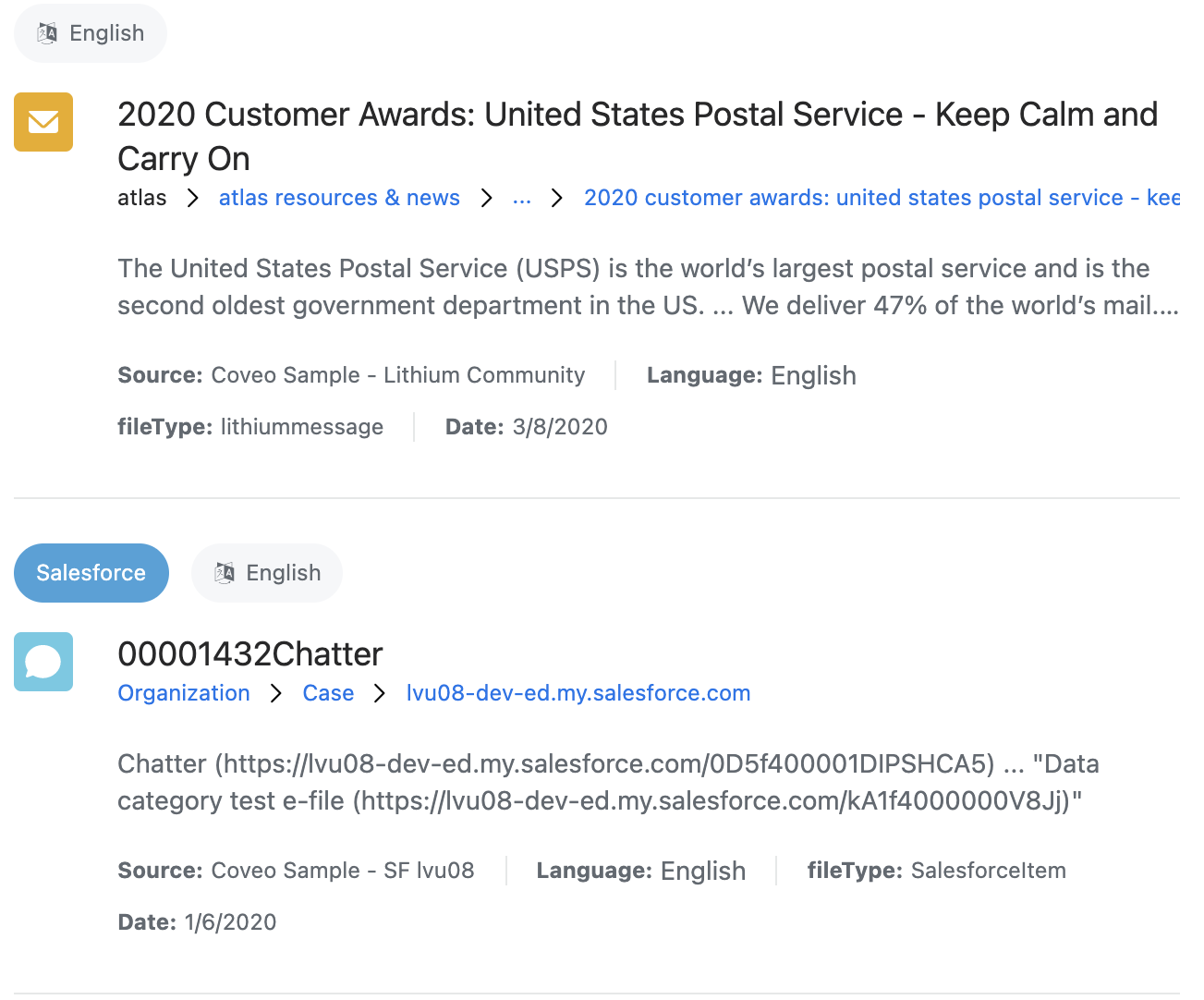
Grid
The grid layout displays a number of columns containing the results. The number of columns varies based on the available space.
<atomic-result-list
  display="grid"
>
  ...
</atomic-result-list>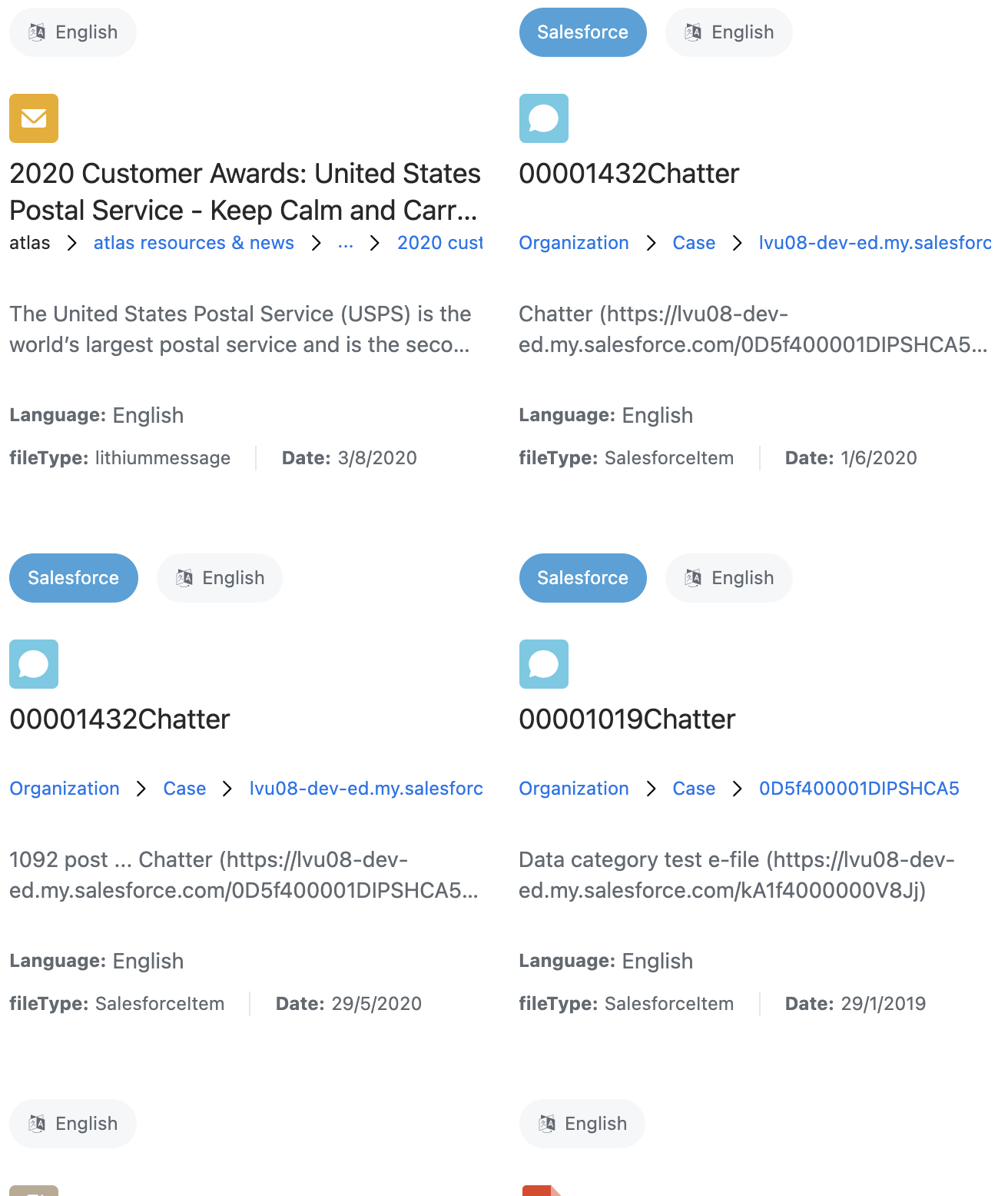
Table
The table layout displays the results in a table. Tables aren’t responsive, so this layout could extend beyond the width of the screen on mobile devices. Unlike the list or grid layouts, you must define columns for the table layout.
<atomic-result-list
  display="table"
>
  ...
</atomic-result-list>
Step 2: Choose an image size
The image attribute defines the expected size of the image, and has four possible values:
-
none -
icon(default) -
small -
large
None
<atomic-result-list
  image-size="none"
>
  ...
</atomic-result-list>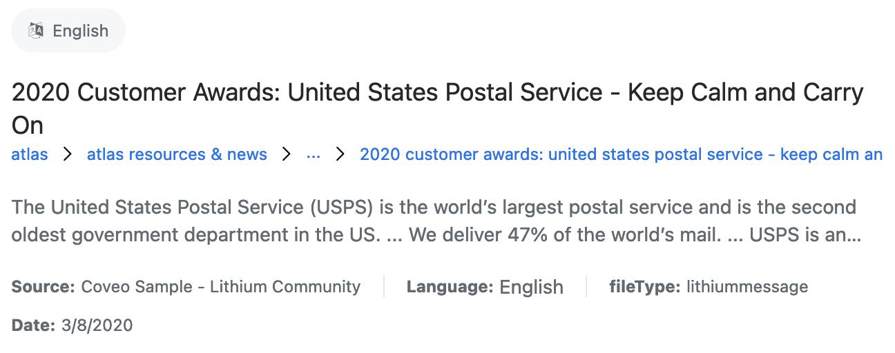
Icon
<atomic-result-list
  image-size="icon"
>
  ...
</atomic-result-list>
Small
<atomic-result-list
  image-size="small"
>
  ...
</atomic-result-list>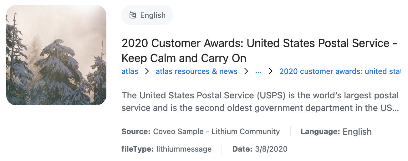
Large
<atomic-result-list
  image-size="large"
>
  ...
</atomic-result-list>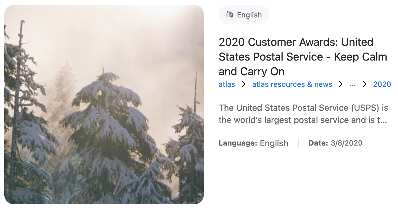
Step 3: Choose a density
The density attribute defines the spacing of various elements in the result list, including the gap between results, the gap between parts of a result, and the font sizes of different parts of a result.
This has three possible values:
-
comfortable -
normal(default) -
compact
Comfortable
<atomic-result-list
  density="comfortable"
>
  ...
</atomic-result-list>
Normal (default)
<atomic-result-list
  density="normal"
>
  ...
</atomic-result-list>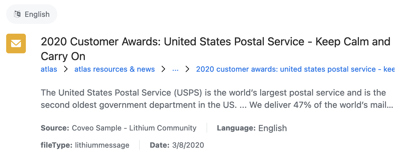
Compact
<atomic-result-list
  density="compact"
>
  ...
</atomic-result-list>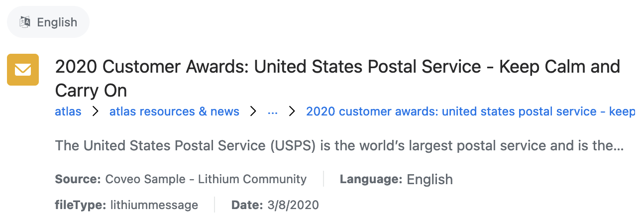
Step 4: Define a result template
Each result rendered will be a copy of a specified result template. You can define multiple result templates with different conditions to personalize different types of results. If a result template doesn’t have any conditions, it’s considered the default template. If no other template conditions are fulfilled, the results are rendered using the default template.
Here’s an example of how to define a template that’s only rendered when the sourcetype field of a result is Salesforce:
<atomic-result-list>
  <atomic-result-template must-match-sourcetype="Salesforce">
    <template>
      ...
    </template>
  </atomic-result-template>
</atomic-result-list>
List or grid layout
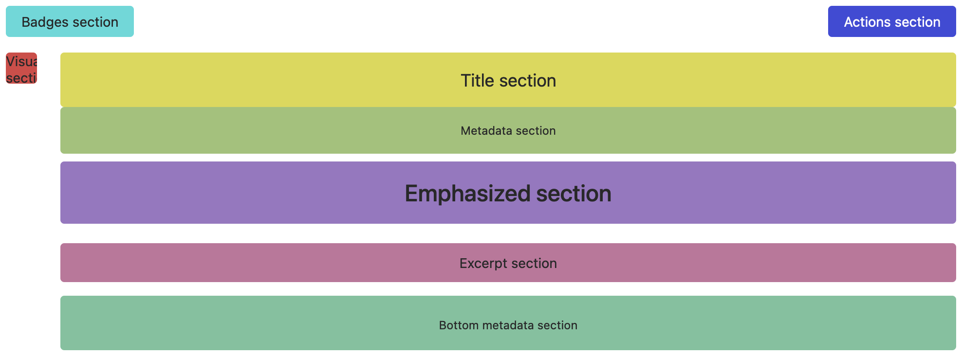
In a list or grid layout, result templates must be divided into multiple building blocks called result sections. Atomic supports eight result sections, each of which has a different purpose and behavior:
-
visual
-
badges
-
actions
-
title
-
title metadata
-
emphasized
-
bottom metadata
Most sections have a font size and a line height that varies based on the layout, the image size, and the density. Result sections are rearranged and resized based on:
-
The layout
-
The density
-
The image size
-
The screen size (mobile or desktop)
Here’s an example of how to define result sections:
<template>
  <atomic-result-section-visual image-size="icon">
    ...
  </atomic-result-section-visual>
  <atomic-result-section-title>
    ...
  </atomic-result-section-title>
  <atomic-result-section-excerpt>
    ...
  </atomic-result-section-excerpt>
  <atomic-result-section-bottom-metadata>
    ...
  </atomic-result-section-bottom-metadata>
</template>
Visual section
Element: atomic-result-section-visual
Attributes:
-
image-size: Enforces a different image size than otherwise specified in the result list.
Purpose: This section provides visual information about the item. For example, in Commerce, an image is a great shorthand for a product category. An icon can quickly show the item type, or an avatar can quickly show the target customer.
Behavior:
-
Has a fixed size that depends on the specified image size, the layout, the density, and the screen size.
-
When the image size is set to icon, this section stays very small.
-
You should ensure that elements inside of it take the available space.
-
-
Always has a 1:1 aspect ratio.
Badges section
Element: atomic-result-section-badges
Purpose: This section provides badges that highlight special features of the item.
Behavior:
-
Exposes the
--row-heightCSS variable so that child elements adjust according to the current line height.-
You should ensure that elements inside of it have
height: var(--row-height).
-
-
Is a wrapping flexbox with a gap.
-
May appear over, next to, or beneath the visual section.
Actions section
Element: atomic-result-section-actions
Purpose: This section allows the information seeker to perform an action on an item without having to view its details. For example, in Commerce you can add an item to the cart directly or add it to a wish list to view at a later time.
Behavior:
-
Exposes the
--row-heightCSS variable so that child elements adjust according to the current line height.-
You should ensure that elements inside of it have
height: var(--row-height).
-
-
Is a wrapping flexbox with a gap.
-
May appear over, next to, or beneath the visual section.
Title section
Element: atomic-result-section-title
Purpose: This section identifies the item by its name, and its main use is to make the result list scannable. This is usually the page title.
Behavior:
-
Has a fixed height of two lines on grid layouts.
-
Exposes the
--line-heightvariable so child elements can adjust to the current line height. -
Has a defined CSS
colorproperty for text.
Title metadata section
Element: atomic-result-section-title-metadata
Purpose: This section surfaces some fields that are directly related to the title of the item. For example, in Commerce, this could be the item's rating, which is tied to the nature of the product itself, rather than to the product’s description.
Behavior:
-
Has a very small font size.
-
Is the closest element beneath the title section.
Emphasized section
Element: atomic-result-section-emphasized
Purpose: This section displays the field that’s important for its search criteria. For example, in Commerce, a product’s cost is often more important than the title itself.
Behavior:
-
Has a very large font size.
-
Is the second closest element beneath the title section.
Excerpt section
Element: atomic-result-section-excerpt
Purpose: This section contains an informative summary of the item's content.
Behavior:
-
Has a fixed height of one to three lines, depending on the layout and density.
-
Ellipses overflowing text.
-
Exposes the
--line-heightvariable so that child elements can adjust to the current line height. -
Has a defined CSS
colorproperty for text.
Bottom metadata section
Element: atomic-result-section-bottom-metadata
Purpose: This section displays additional descriptive information about the item.
Behavior:
-
Has a maximum height of two lines.
-
We recommend that you use
atomic-result-fields-listto ensure that the fields in this section don’t overflow.
-
-
Exposes the
--line-heightvariable so child elements can adjust to the current line height. -
Has a defined CSS
colorproperty for text. -
Has a font weight.
Table layout

In a table layout, result templates must be divided into titled columns:
<template>
  <atomic-table-element label="Description">
    ...
  </atomic-table-element>
  <atomic-table-element label="author">
    ...
  </atomic-table-element>
  <atomic-table-element label="source">
    ...
  </atomic-table-element>
  <atomic-table-element label="language">
    ...
  </atomic-table-element>
  <atomic-table-element label="file-type">
    ...
  </atomic-table-element>
</template>
Step 5: Add template components
Each result is a copy of the template. However, template components will vary based on the result that they’re in. The following result components are currently supported:
-
Interactive components
-
Visual components
-
Field value components
-
Organizational components
Step 6: Style result templates
It’s possible to style results by adding a style tag inside their result template:
<atomic-result-list>
  <atomic-result-template>
    <template>
      <style>
        ...
      </style>
      ...
    </template>
  </atomic-result-template>
</atomic-result-list>
You can use parts to customize the contents of certain components, such as the atomic-result-badge:
atomic-result-badge::part(result-badge-element) {
  background-color: var(--atomic-primary);
  color: var(--atomic-on-primary);
} Very useful
 Not really
 Very useful
 Not really