Use the ResultTemplate component
Use the ResultTemplate component
Quantic lets you define templates for multiple types of search results to customize how they look.
Further, Quantic provides a ResultTemplate component, which provides a recommended display structure using predefined and formatted slots.
Using this component eases the process of creating new templates that are both responsive and stylistically cohesive.
While optional, we recommend using this component when building result templates.

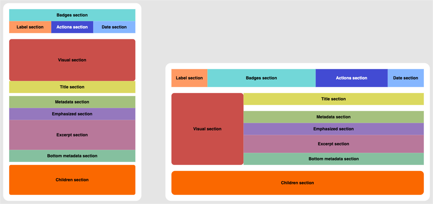
To use the ResultTemplate component, you divide your result template into multiple building blocks called result sections. Quantic supports a variety of result sections, each of which has a different purpose and behavior:
Result sections are flexible to fit their content and rearrange themselves based on the screen size, following the Salesforce Lightning Design System (SLDS) responsive layout options.
Here’s an example of how to define result sections:

<template>
 <c-quantic-result-template>
   <c-quantic-result-label slot="label" result={result}></c-quantic-result-label>

   <div slot="badges" class="slds-grid slds-grid_vertical-align-center">
     <div class="slds-m-right_xx-small">
       <c-quantic-result-badge variant="recommended" result={result}></c-quantic-result-badge>
     </div>
     <c-quantic-result-badge variant="featured" result={result}></c-quantic-result-badge>
   </div>

   <template if:true={resultHasPreview}>
     <c-quantic-result-quickview slot="actions" engine-id={engineId} result={result}></c-quantic-result-quickview>
   </template>

   <p slot="date" class="slds-size_xx-small">
     <lightning-formatted-date-time value={result.raw.date}></lightning-formatted-date-time>
   </p>

   <h3 slot="title">
     <c-quantic-result-link result={result} engine-id={engineId}></c-quantic-result-link>
   </h3>

   <div slot="visual" class="slds-size_1-of-1 slds-medium-size_1-of-4 slds-large-size_1-of-4 slds-p-right_x-small slds-m-bottom_x-small">
     <img style="border-radius: 4px; border: none;" src={videoThumbnail}></img>
   </div>

   <div slot="excerpt">
     {result.Excerpt}
   </div>

   <div slot="bottom-metadata" class="slds-grid slds-text-align_left slds-m-top_xx-small" style="font-size: 10px">
     <lightning-icon icon-name="utility:clock" size="xx-small"></lightning-icon>
     <span class="slds-m-left_xxx-small">{videoTimeSpan}</span>
   </div>
 </c-quantic-result-template>
</template>
Template section reference
Label section
Slot: "label"
Purpose: This section provides information about the type of result.
We recommend using it with a quantic-result-label component to display a label describing the result type with an appropriate icon for quick identification.
Behavior: Disappears when empty.
Badges section
Slot: "badges"
Purpose: This section provides badges that highlight special attributes of the item.
We recommend using it to display a quantic-result-badge.
Behavior:
-
Appears as the top section in
smalllayouts. -
Disappears when empty.
Actions section
Slot: "actions"
Purpose: This section allows the information seeker to perform an action on an item without having to view its details.
For example, it can contain the quantic-result-quickview component to open a content preview in a modal.
Behavior: Disappears when empty.
Date section
Slot: "date"
Purpose: This section provides a date related to the given result.
Behavior:
-
Has a defined CSS font-size property for text.
-
Has a defined CSS color property for text.
-
Disappears when empty.
Visual section
Slot: "visual"
Purpose: This section provides visual information about the item. For example, in a commerce interface, an image is a great shorthand for a product category. An icon can quickly show the item type, or an avatar can quickly show the target customer.
Behavior:
-
Responsive SLDS grid size classes should be given to a container element for the image to display. This element should be the one attributed to the slot.
-
May appear above or beside the Title section.
-
Disappears when empty.
Title section
Slot: "title"
Purpose: This section identifies the item by its name, and its main use is to make the result list scannable.
This is usually the page title.
We recommend using it to display a quantic-result-link.
Behavior:
-
Has a defined CSS font-size property for text.
-
Has a defined CSS font-weight property for text.
-
Disappears when empty.
Metadata section
Slot: "metadata"
Purpose: This section surfaces some fields that are directly related to the title of the item. For example, in a service interface, this could be the author of a Chatter post.
Behavior:
-
Is the closest element beneath the title section.
-
Disappears when empty.
Emphasized section
Slot: "emphasized"
Purpose: This section displays the field which is the most relevant based on the search criteria. For example, in a commerce interface, the product cost is often more important than the title itself.
Behavior:
-
Is the second closest element beneath the title section.
-
Disappears when empty.
Excerpt section
Slot: "excerpt"
Purpose: This section contains an informative summary of the item content.
Behavior: Disappears when empty.
Bottom metadata section
Slot: "bottom-metadata"
Purpose: This section displays additional descriptive information about the item.
Behavior: Disappears when empty.
Children section
Slot: "children"
Purpose: This section contains the QuanticResultChildren component which renders child results.
Behavior: Disappears when empty.